P
Sports Nutrition & Supplements · Qatar · 2025 — 2026
Popaya Nutrition
Scroll
Popaya Nutrition is a sports nutrition and supplements retailer — whey and protein bars, pre-workout, carb fuel, vitamins and everyday wellness for athletes, gym members and families.
A strong retail presence and a cult-classic mascot, but a feed where every international brand it carried was screaming in a different visual language.
Dozens of partner brands, each with their own strict guidelines, competing with weekly promos, Ramadan and Eid moments and new-arrival drops — all inside one Instagram grid.
The category defaults to loud: neon, explosions, all-caps. We had to keep the energy but replace the noise with structure.
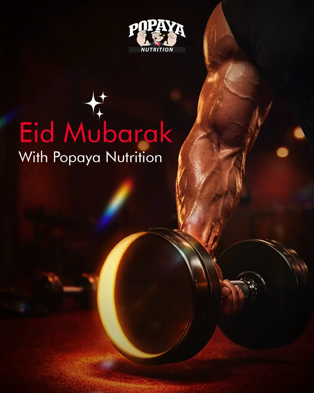
Headworks became the studio behind the daily output: a locked art-direction system, a modular campaign and offer template family, seasonal key visuals and a library of vertical product films.
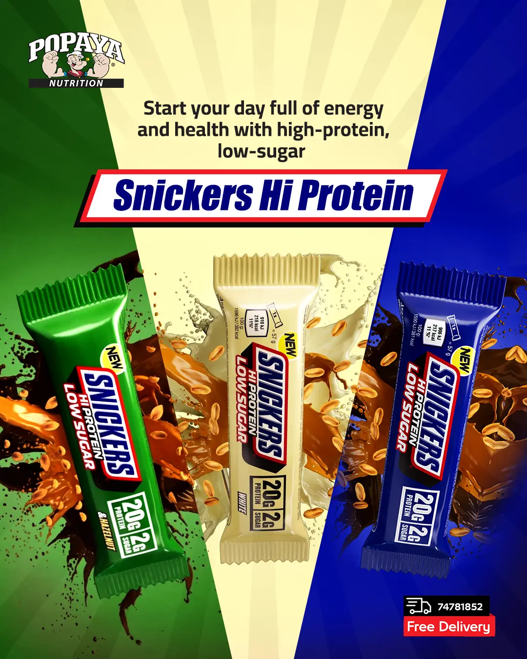
One grid, one type scale, one energy — from product cut-outs to Eid campaigns.
 01
01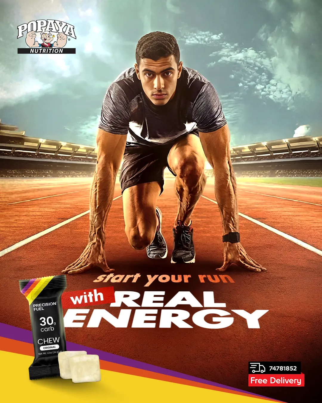 02
02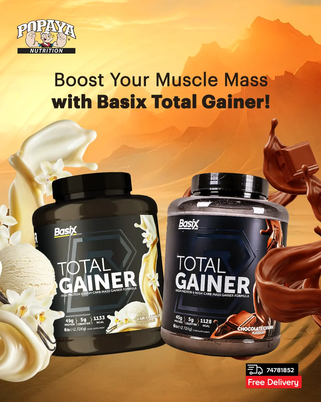 03
03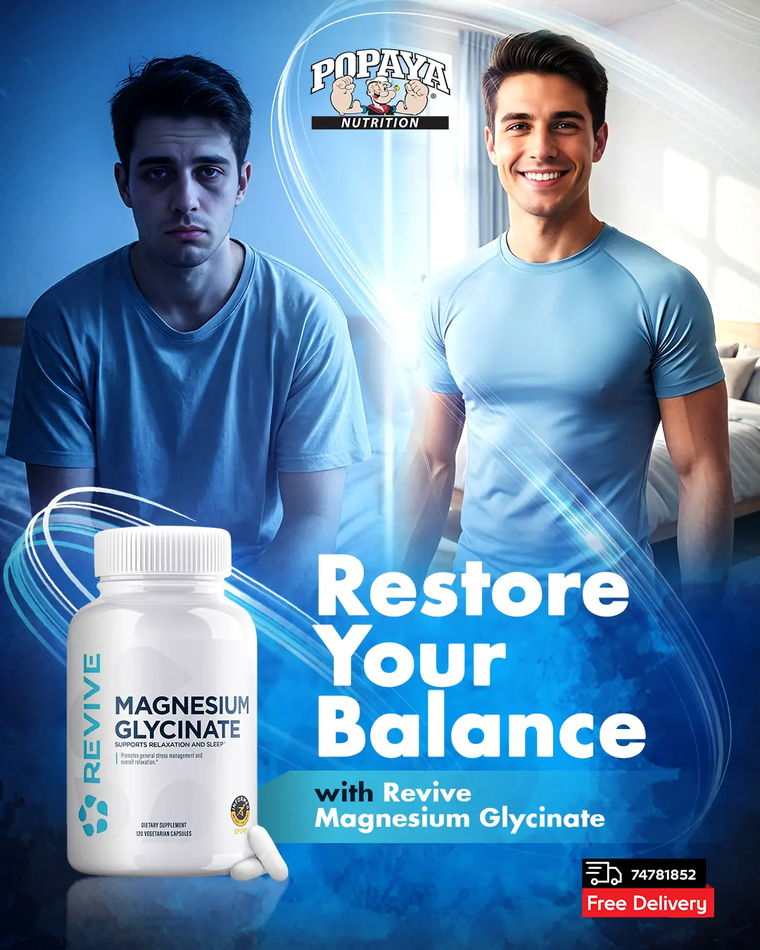 04
04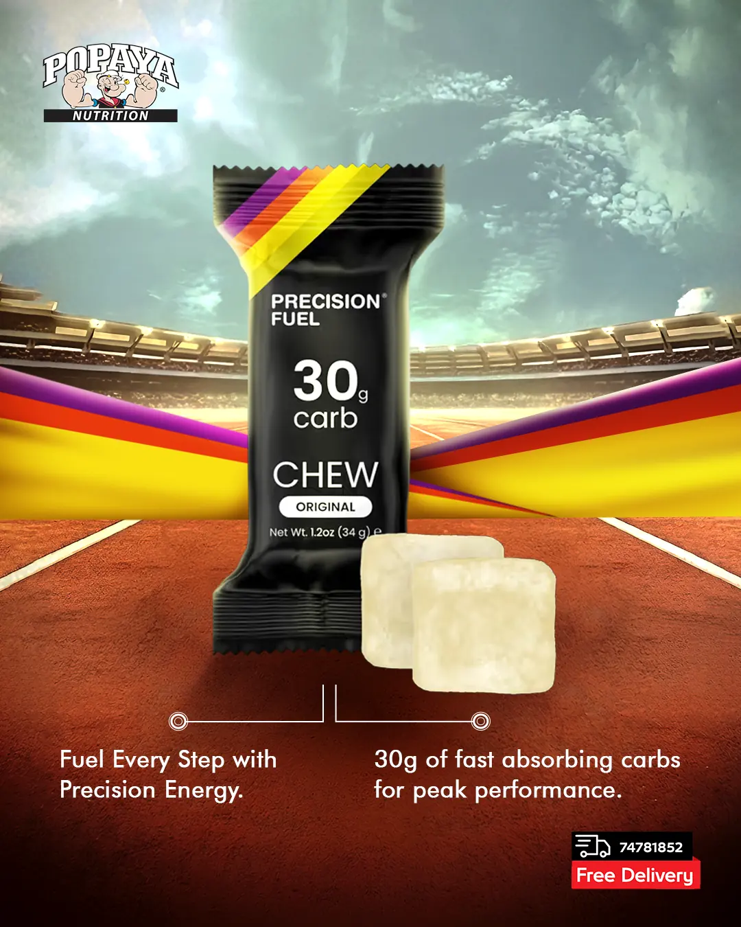
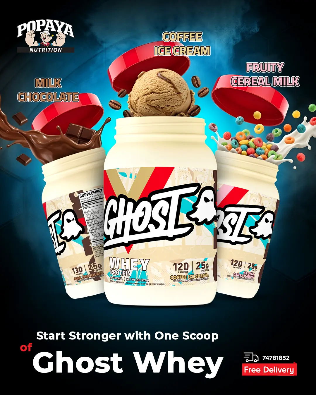
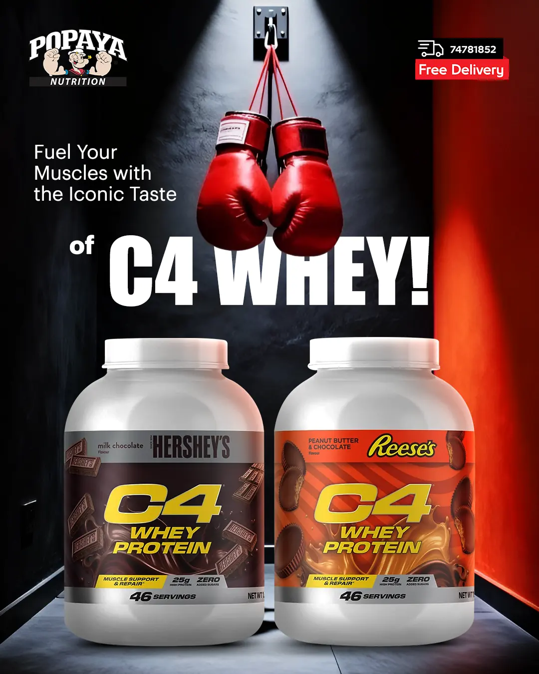
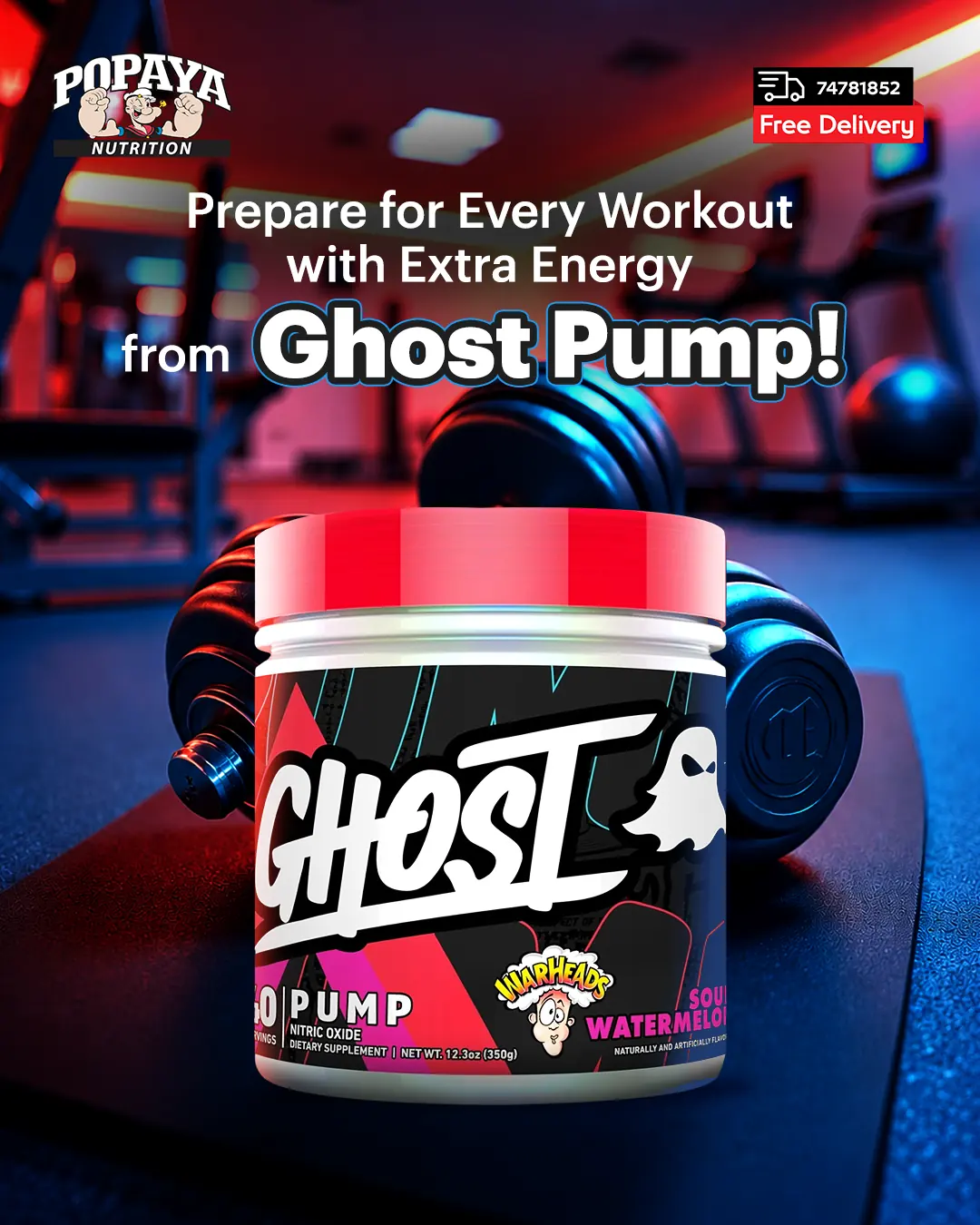
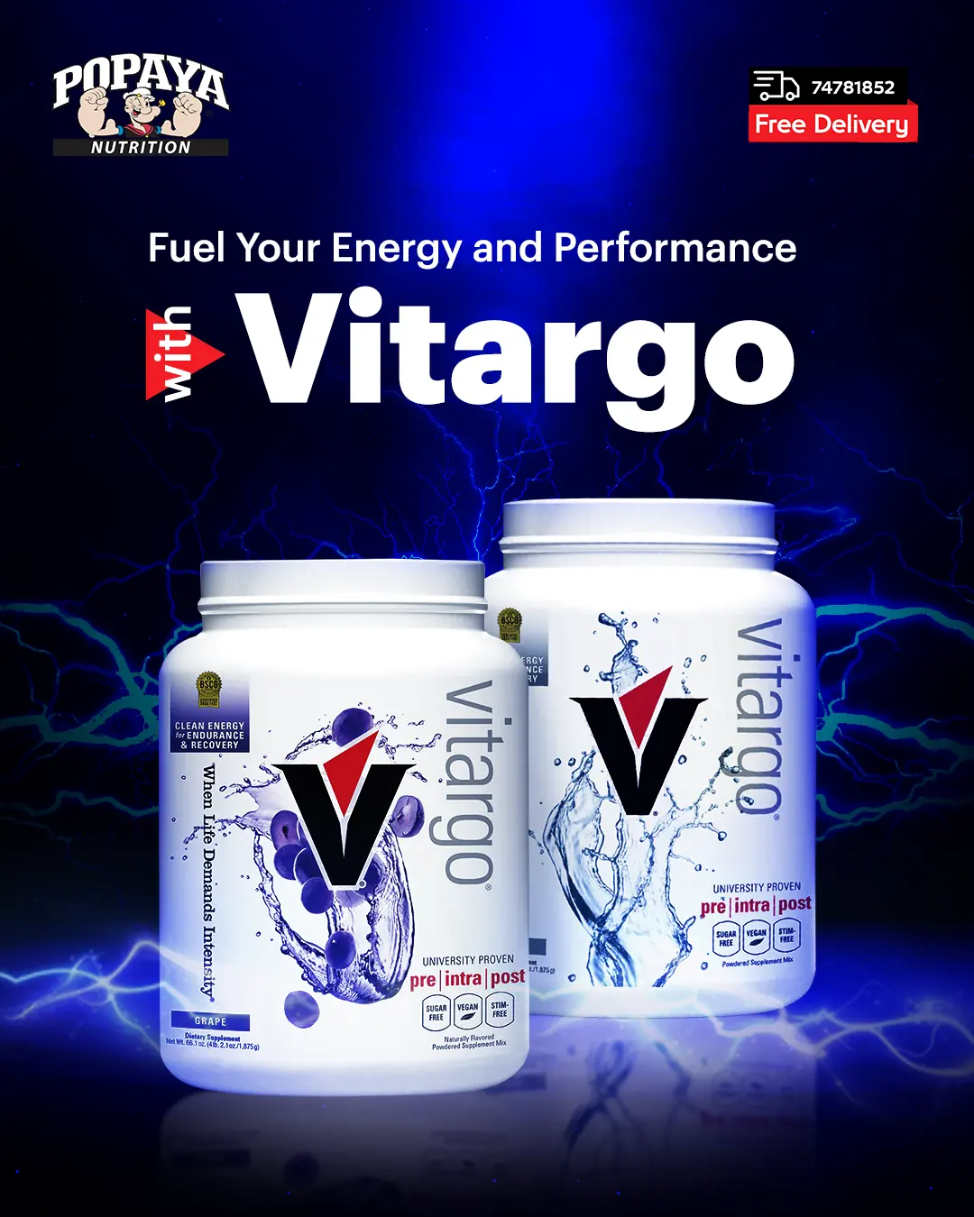
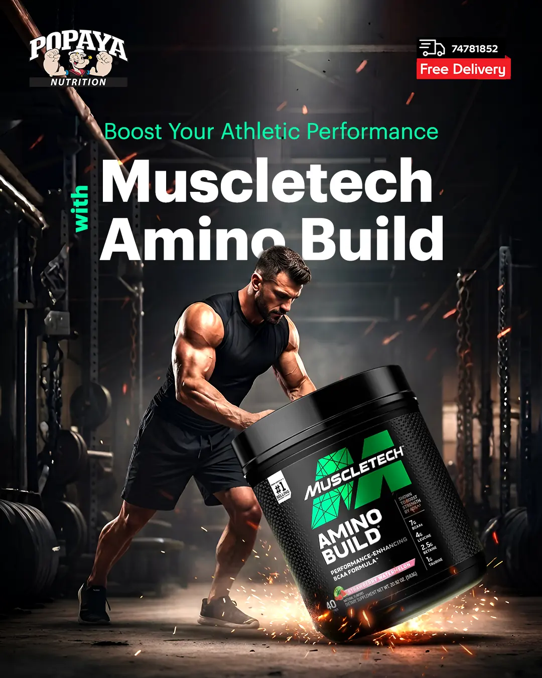
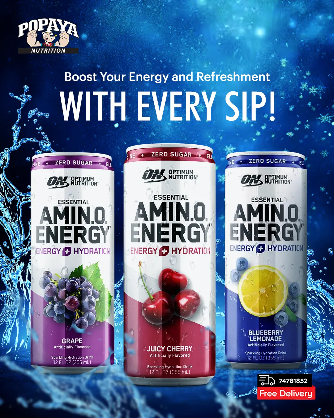
Vertical films built for the gym scroll: two seconds to hook, three to explain the formula, one to make it desirable. Shot lists, motion, typography and pacing designed as one template family so every partner brand still reads as Popaya.
 05
05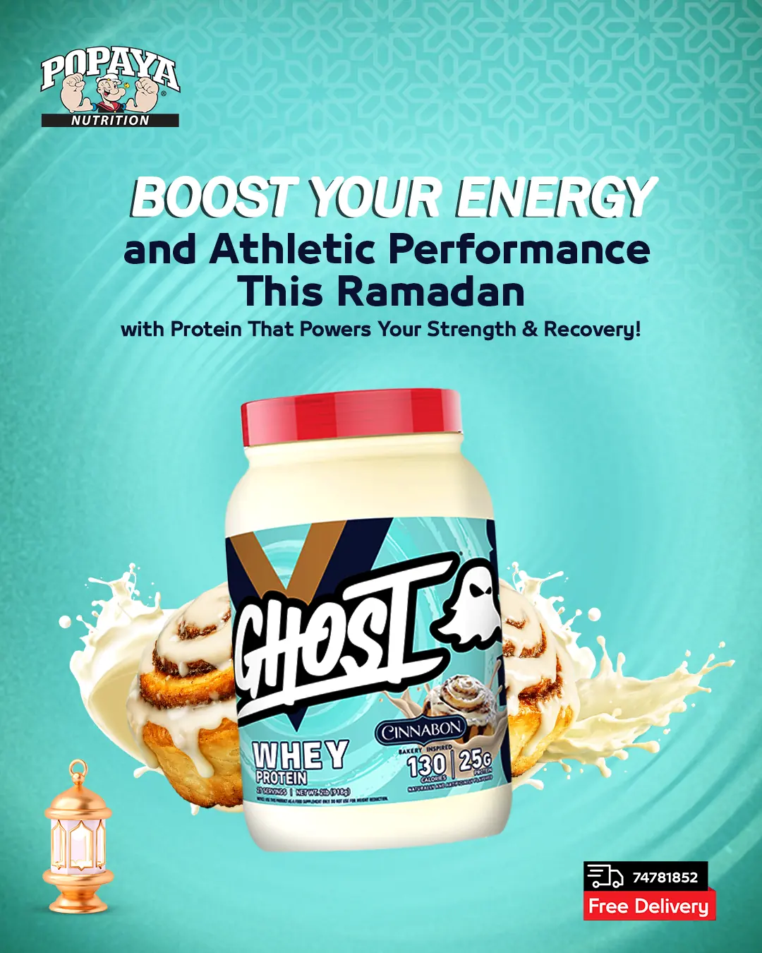 06
06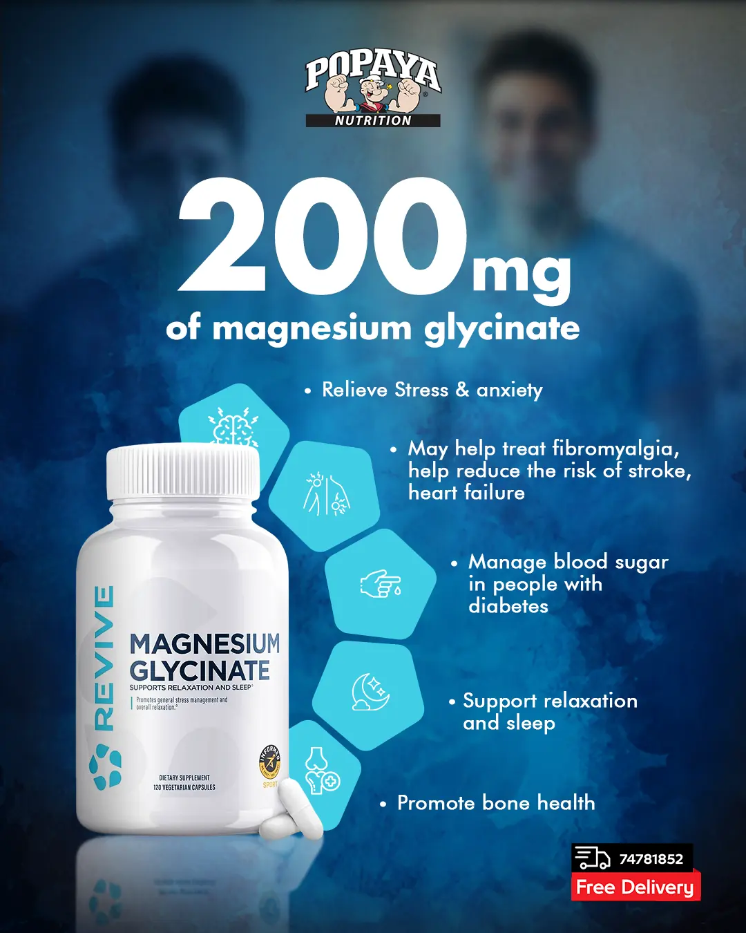 07
07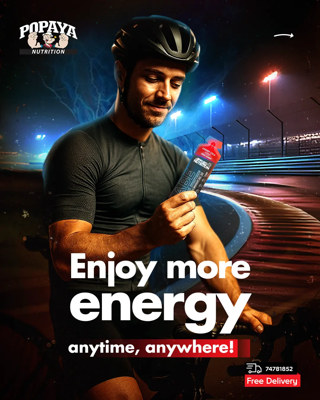 08
08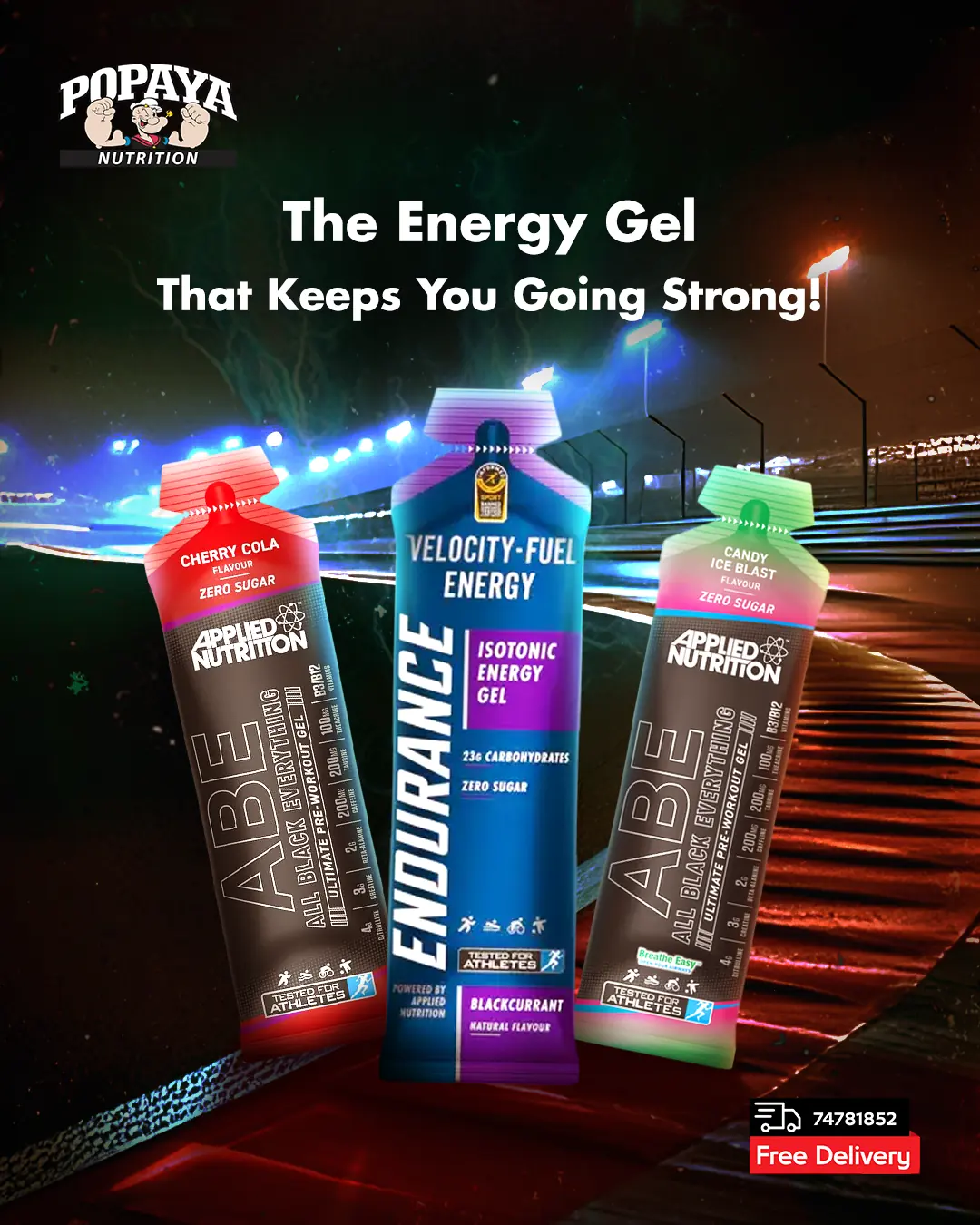 09
09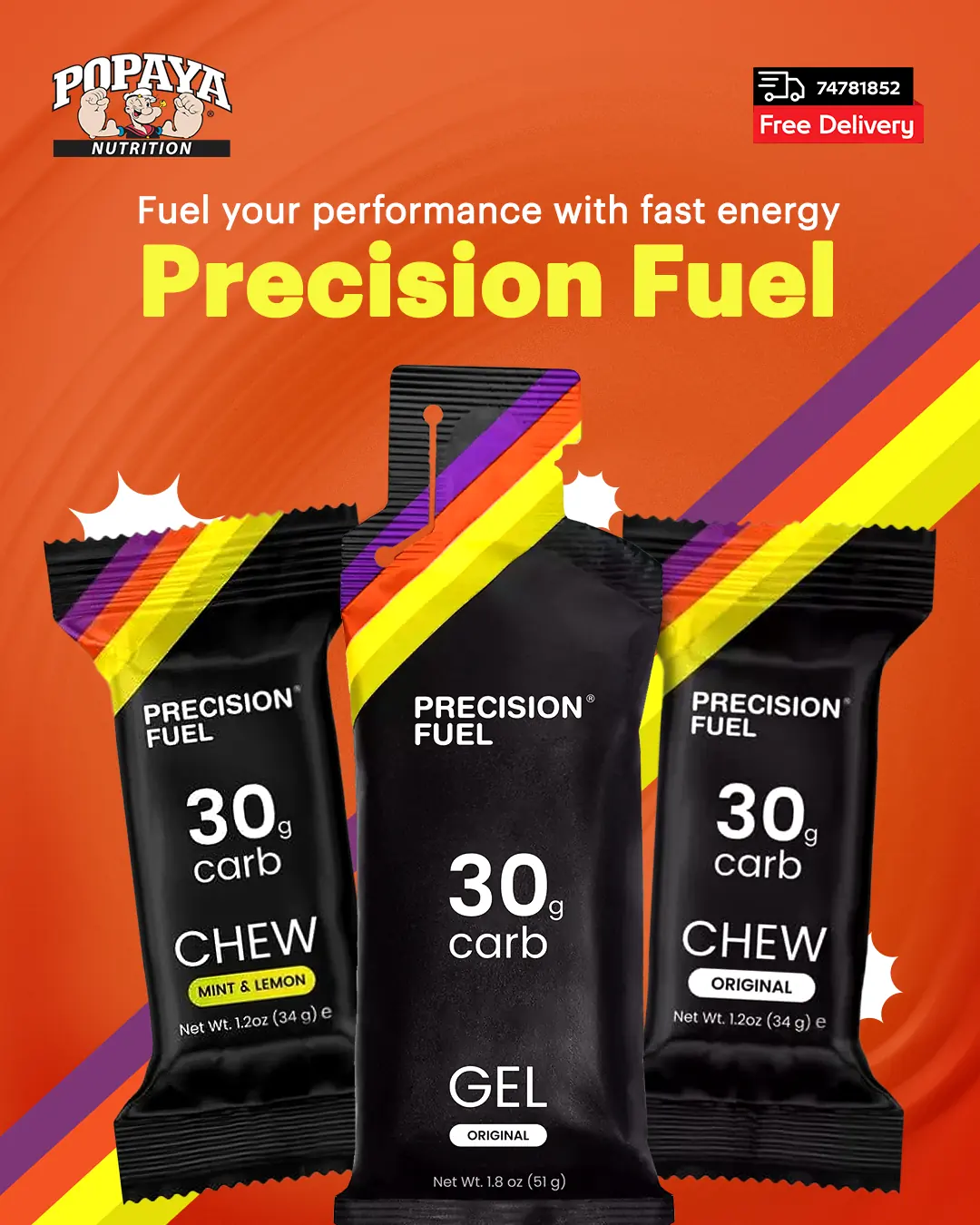

 10
10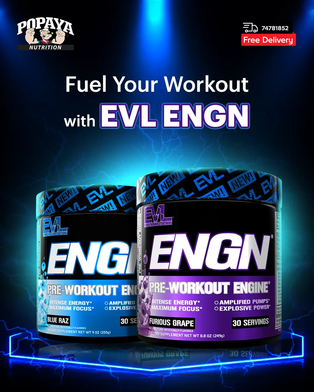 11
11 12
12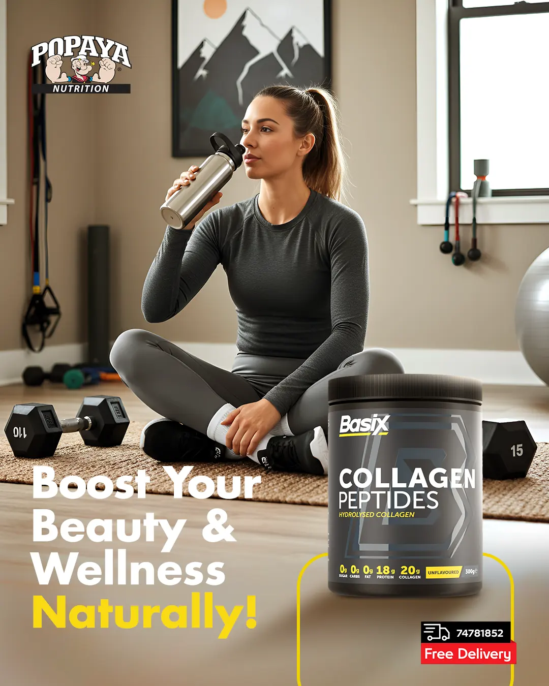 13
13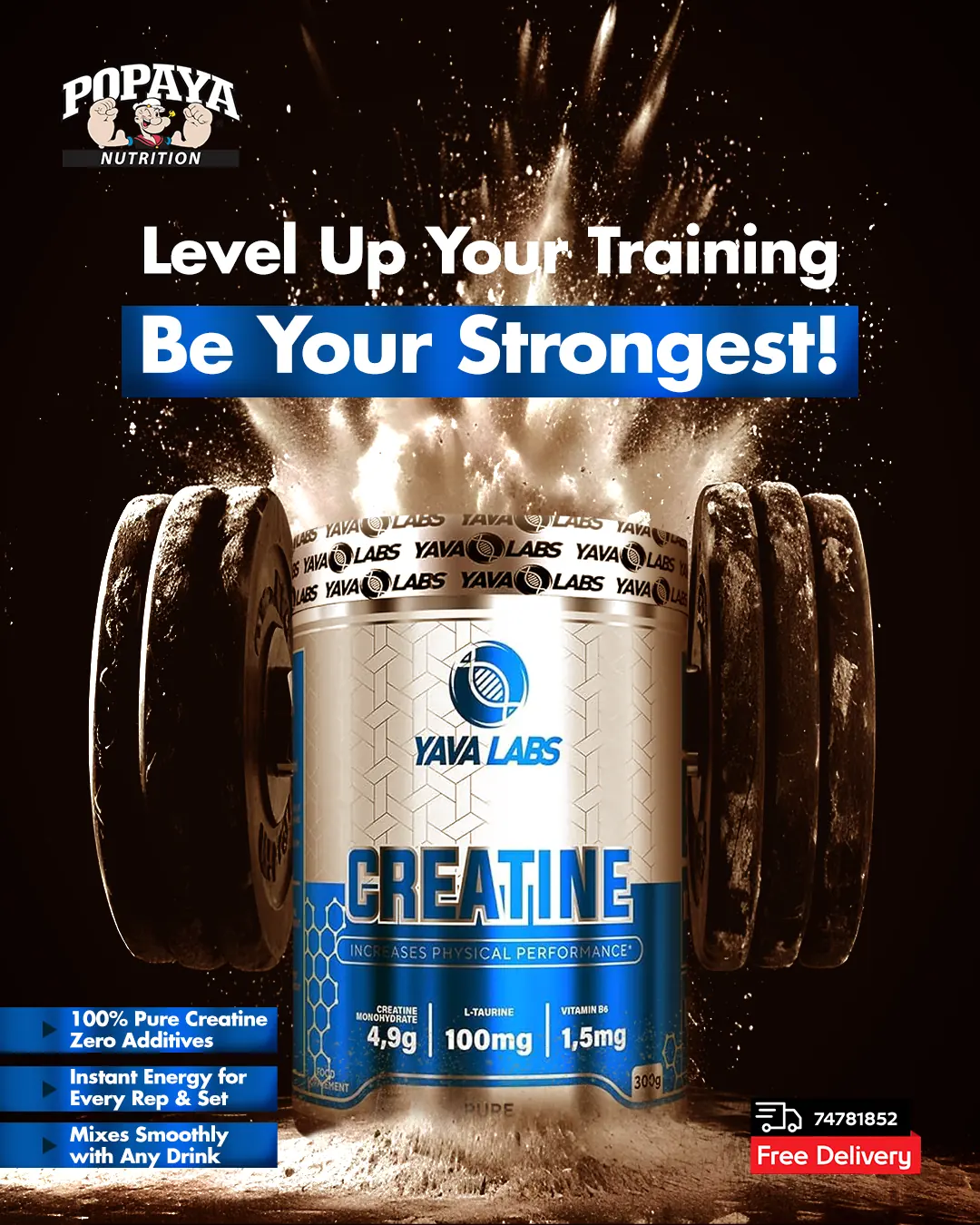 14
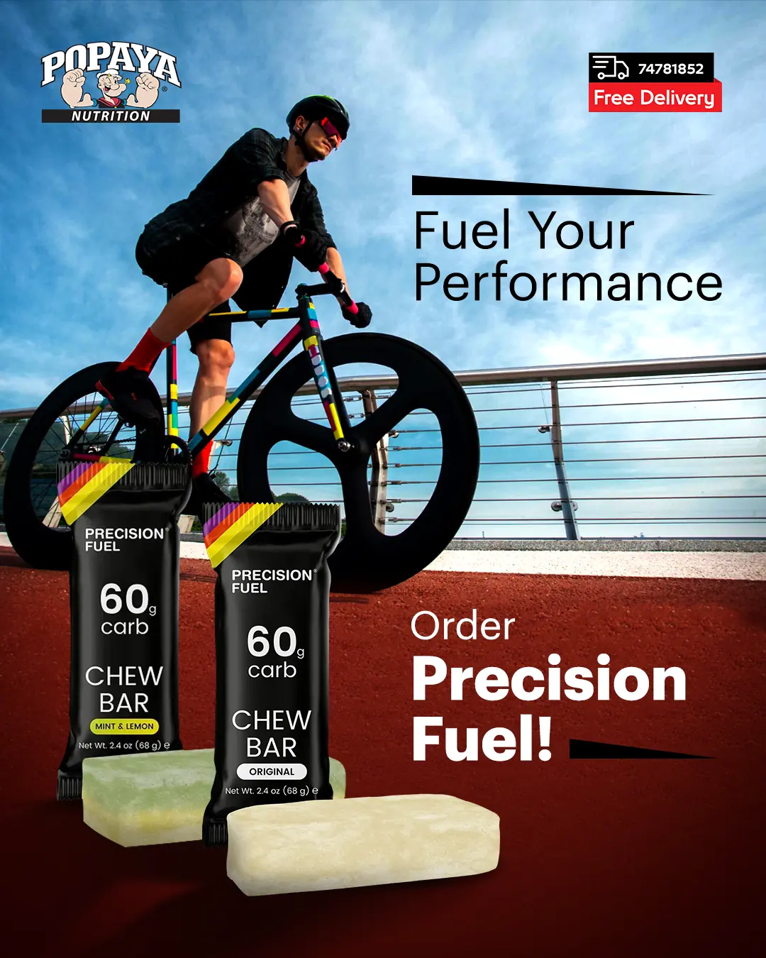
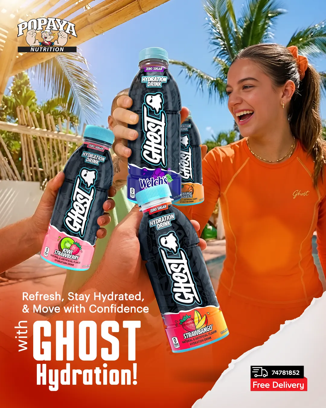
14A locked grid, type scale and colour discipline turned a crowded partner-brand feed into a recognisable Popaya feed — identifiable before the logo is read.
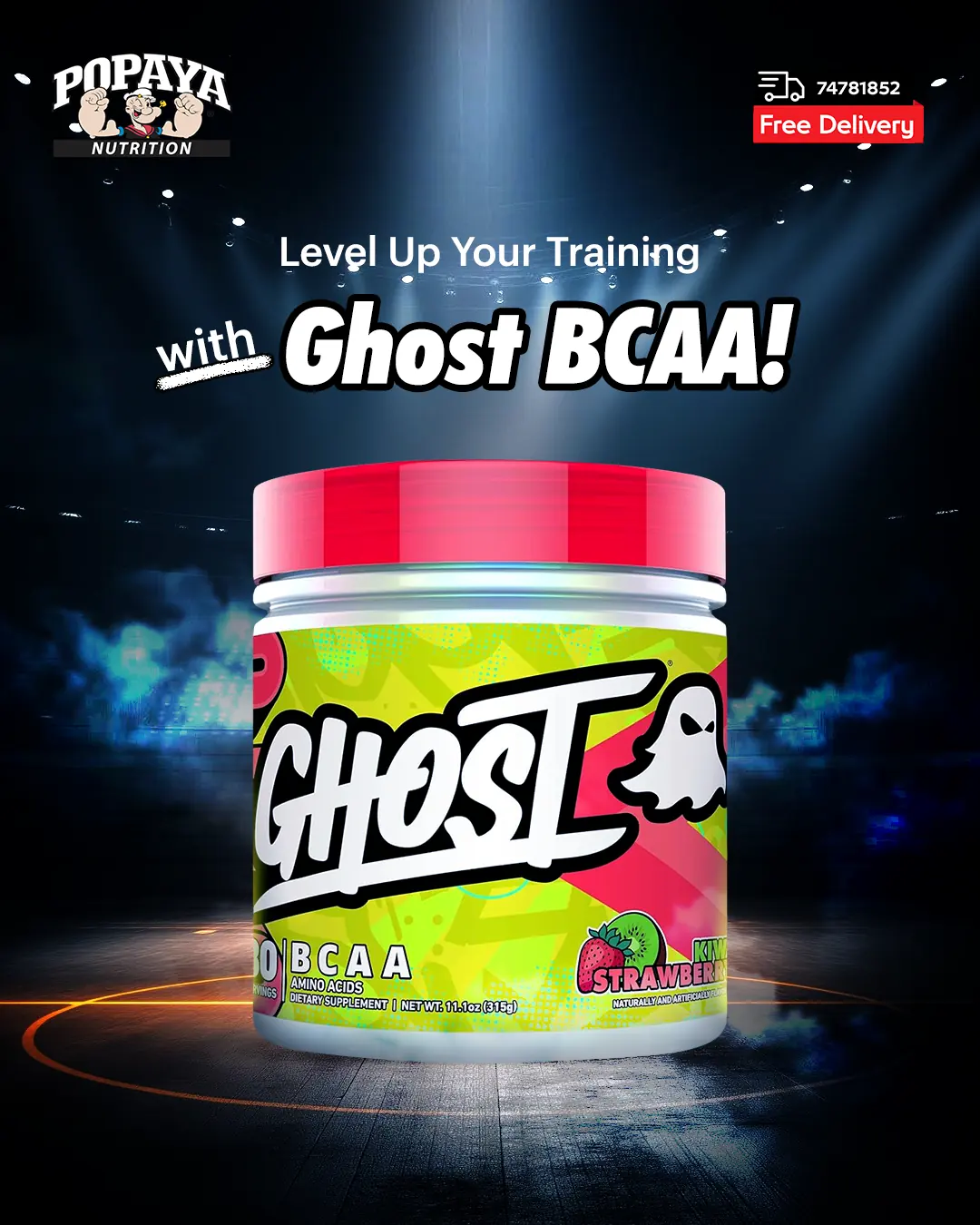
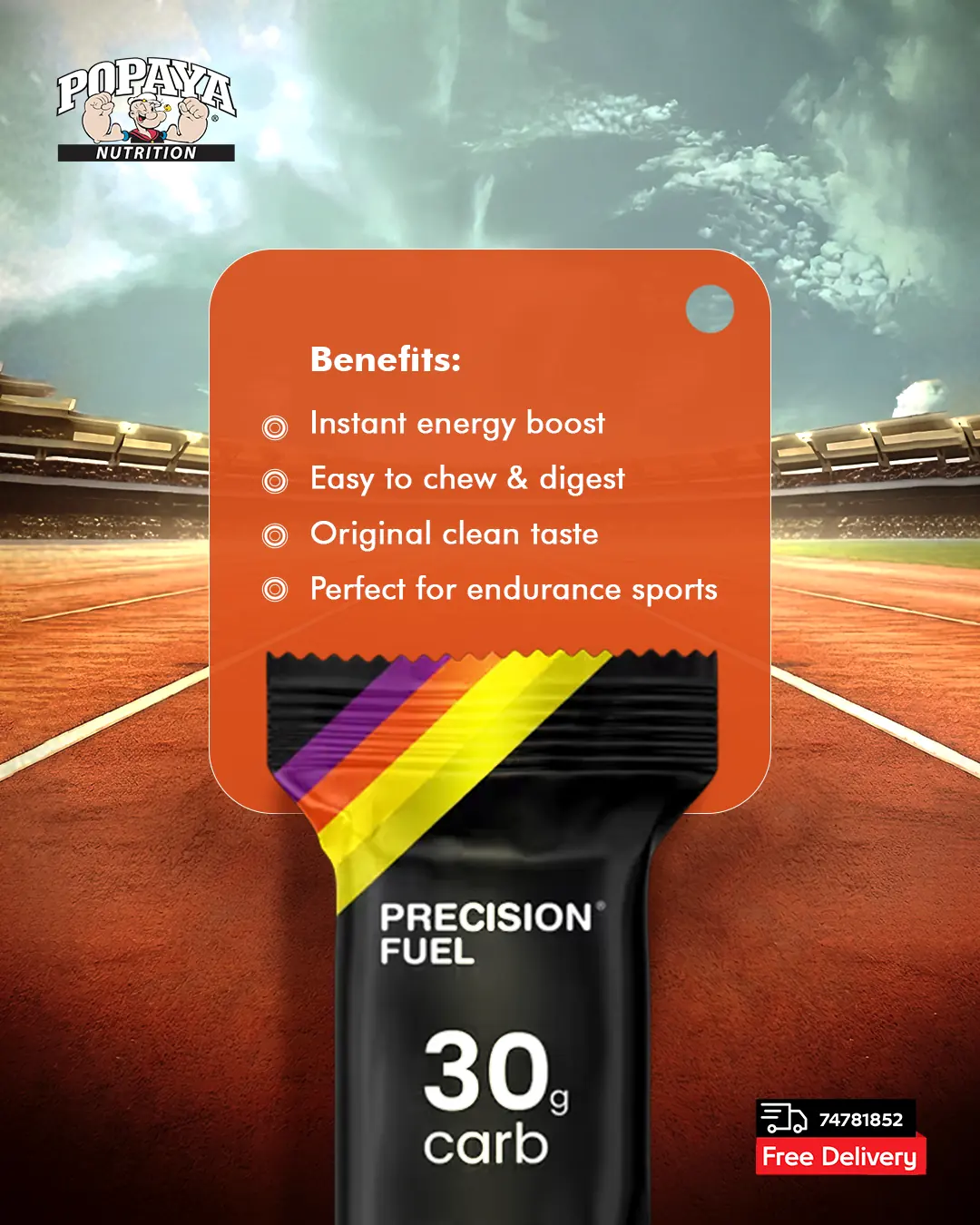
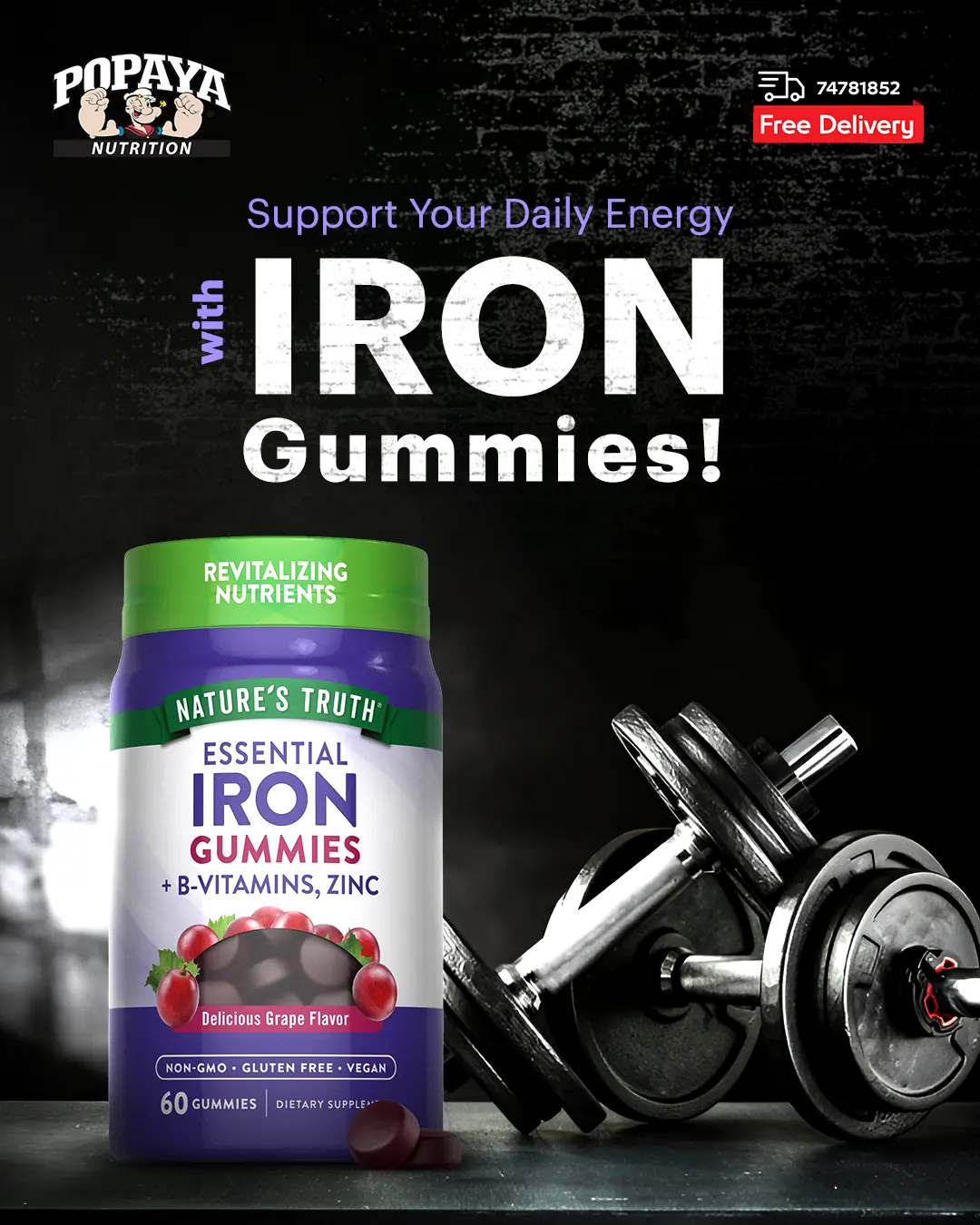
Studio-lit product cut-outs, controlled gradients and confident typography made supplements look engineered instead of shouted.
Modular templates let new arrivals, promos and seasonal moments ship weekly across languages without redesigning from zero.