S
Skincare & Personal Care · 2024 — 2026
Sweet Secret
Scroll
Sweet Secret is a skincare and personal-care destination — derma brands, cleansers and serums, sun care, hair care, baby care and everyday beauty essentials.
A romantic pink identity with real product authority behind it: pharmacy-grade brands sold with the warmth of a beauty boutique.
Dozens of partner brands — each with locked guidelines — competing with weekly offers, seasonal drops, giveaways and Eid moments inside one grid.
The category defaults to clutter: stacked product shots, price stickers, five fonts per post. We had to keep the commercial pressure but make it look considered.
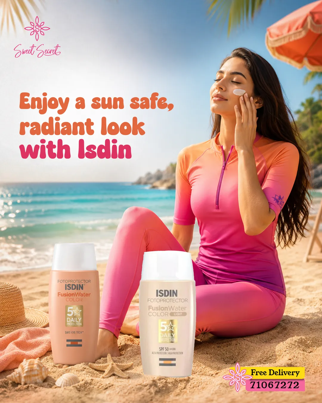
Headworks built the daily output: a locked art-direction system, a modular campaign and offer template family, seasonal key visuals and a library of vertical product films.
One grid, one type scale, one pink — from a single serum to a full Eid campaign.
 01
01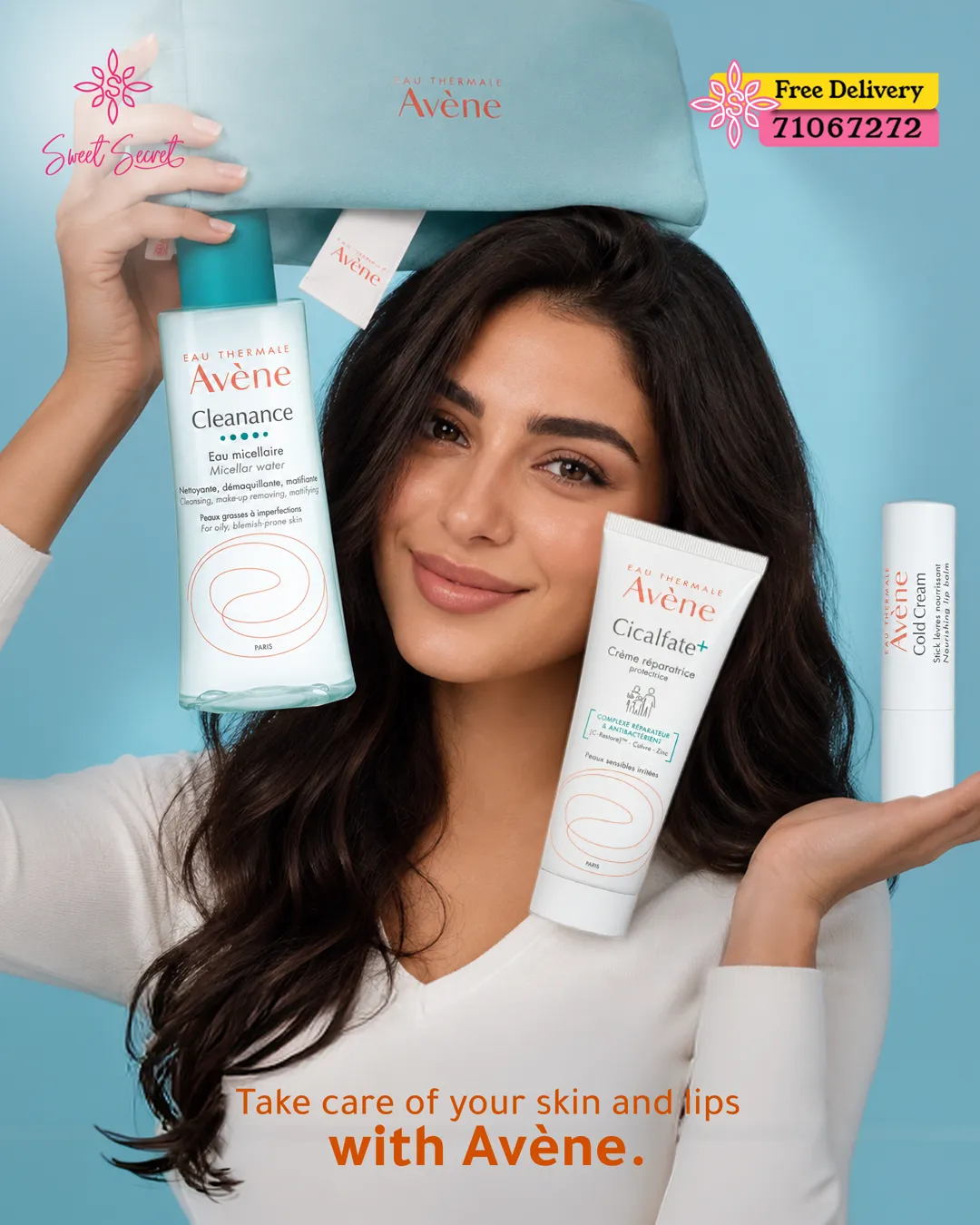 02
02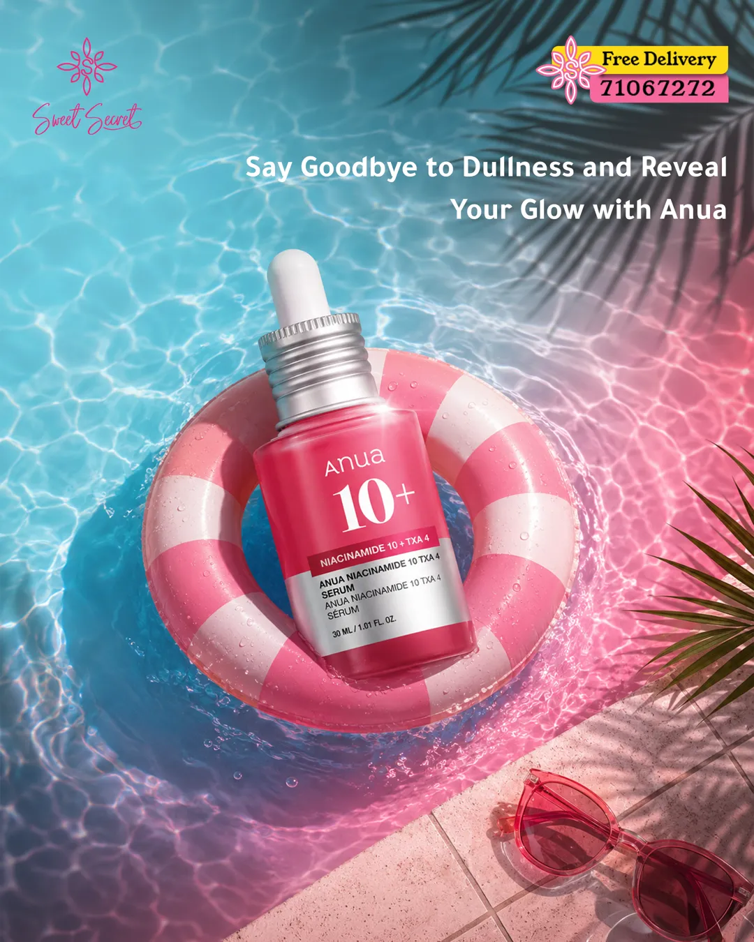 03
03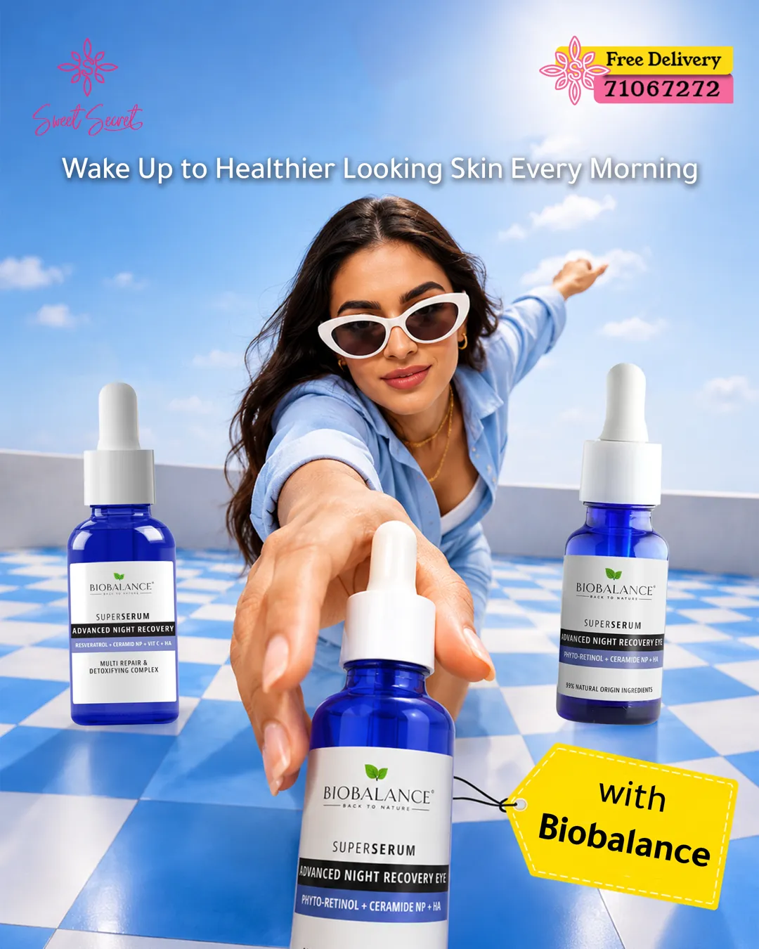 04
04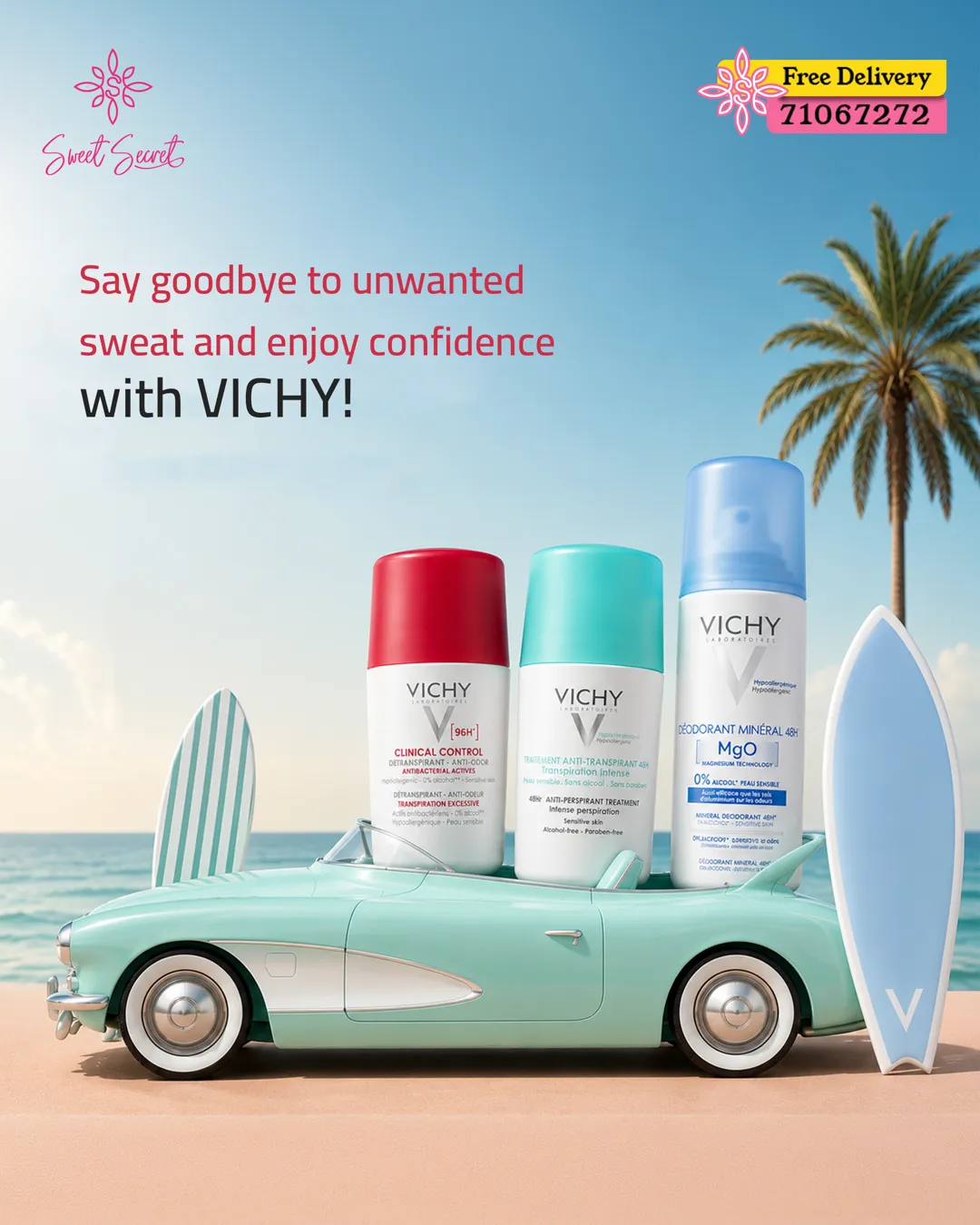
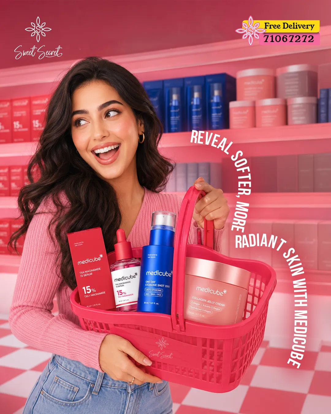
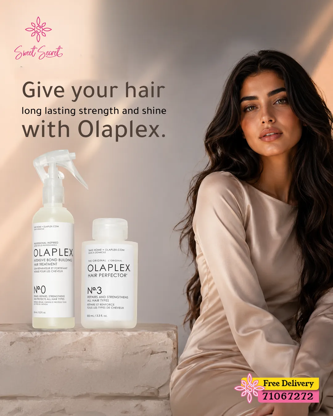
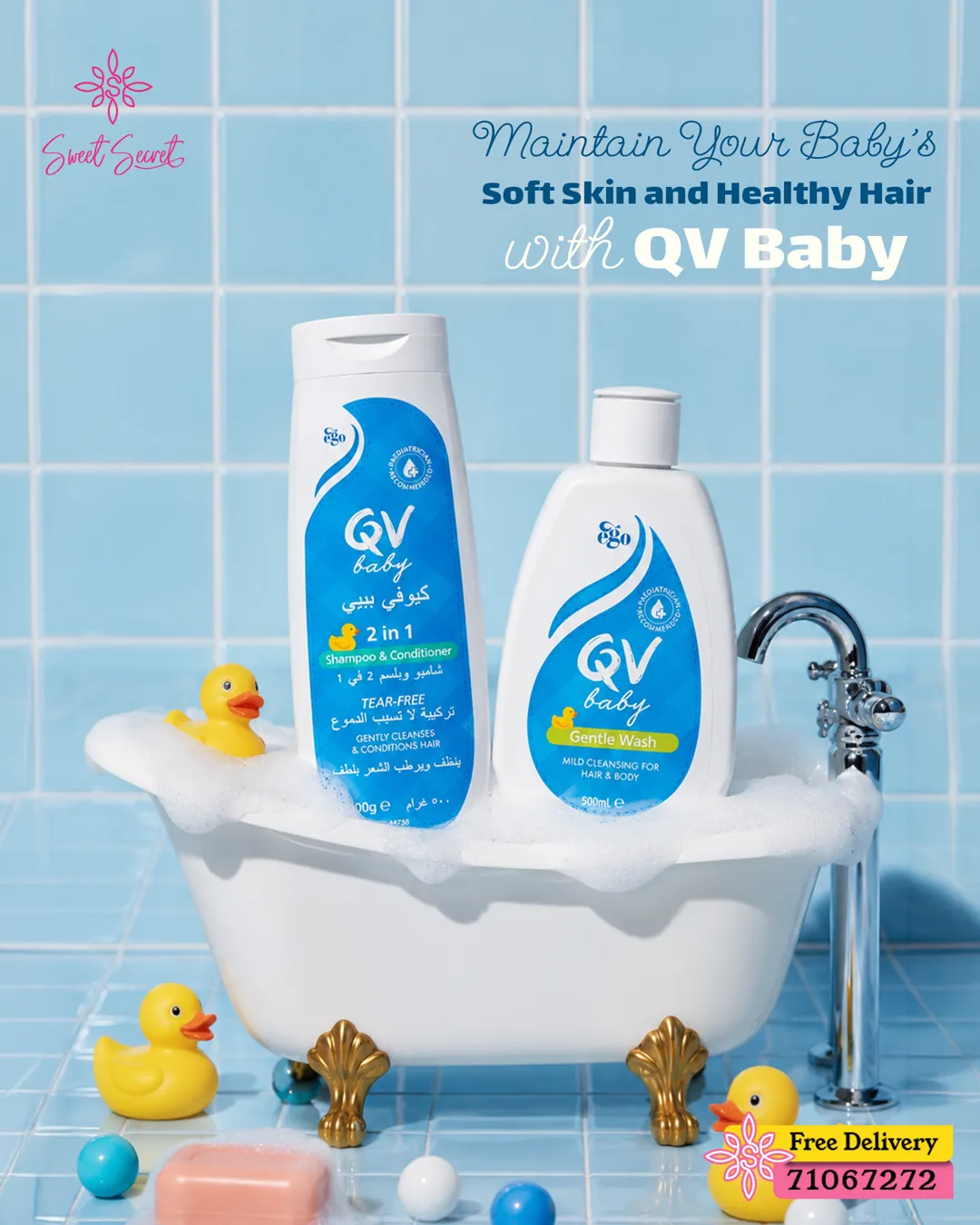
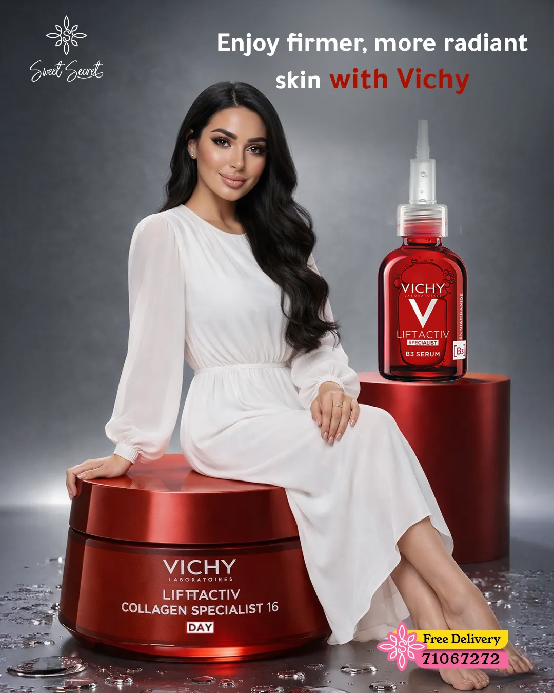
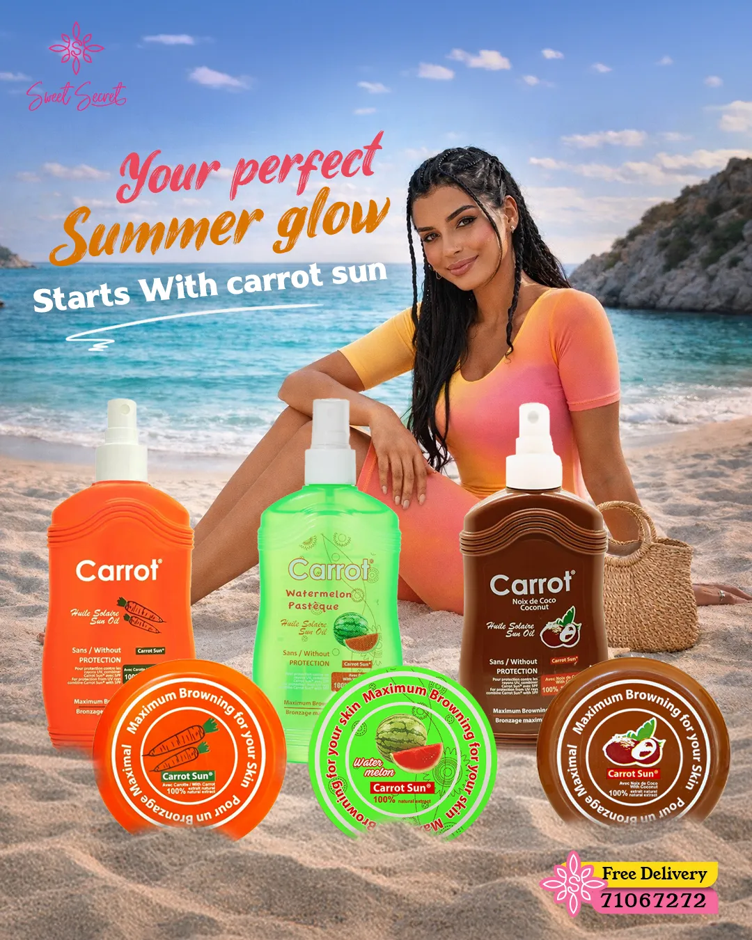
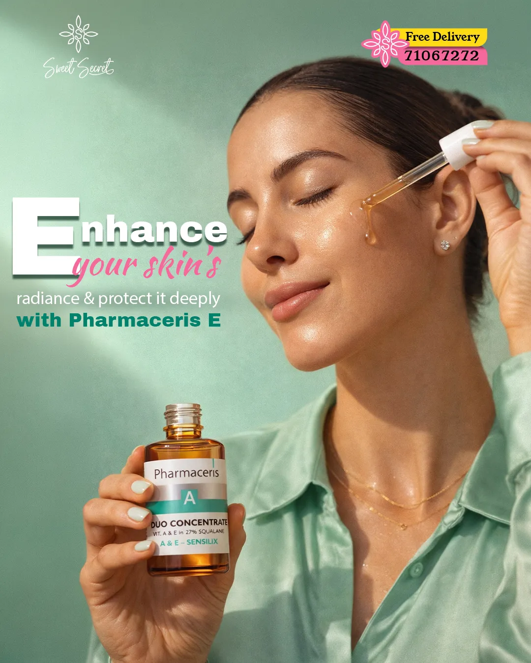
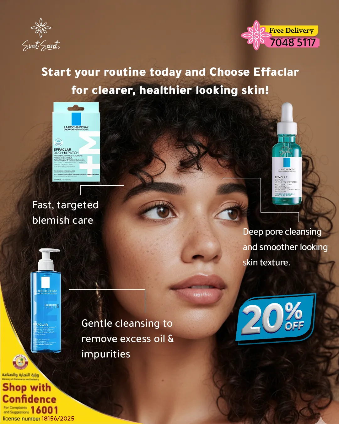
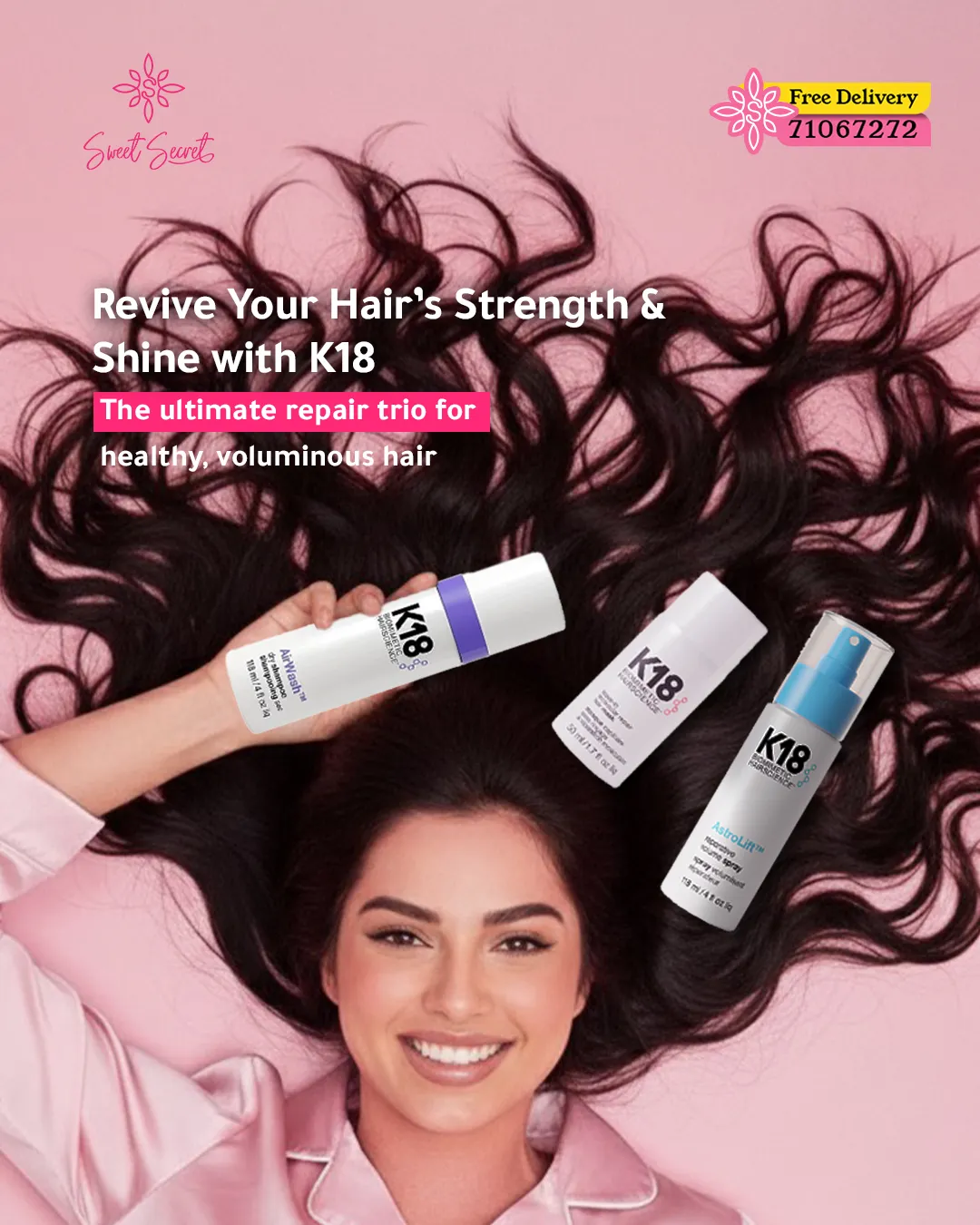
Vertical films built for the beauty scroll: a texture shot to hook, an ingredient beat to convince, a clean pack-shot to close. Motion, typography and pacing designed as one template family so every partner brand still reads as Sweet Secret.
 05
05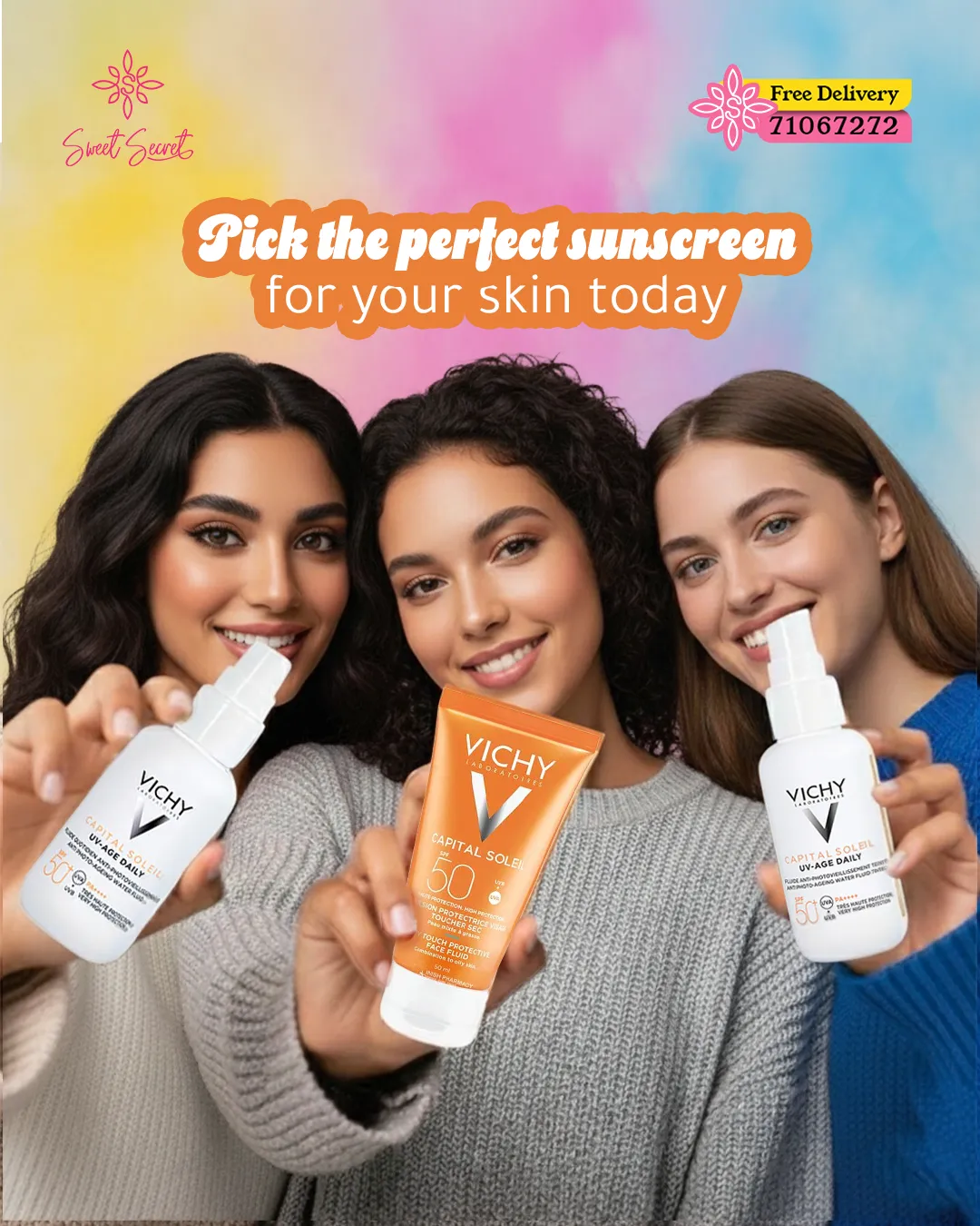 06
06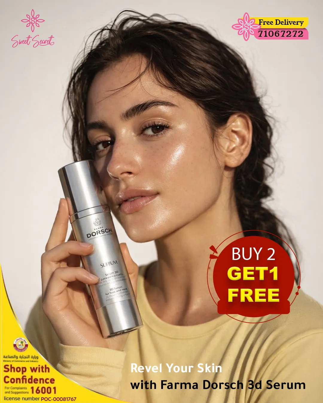 07
07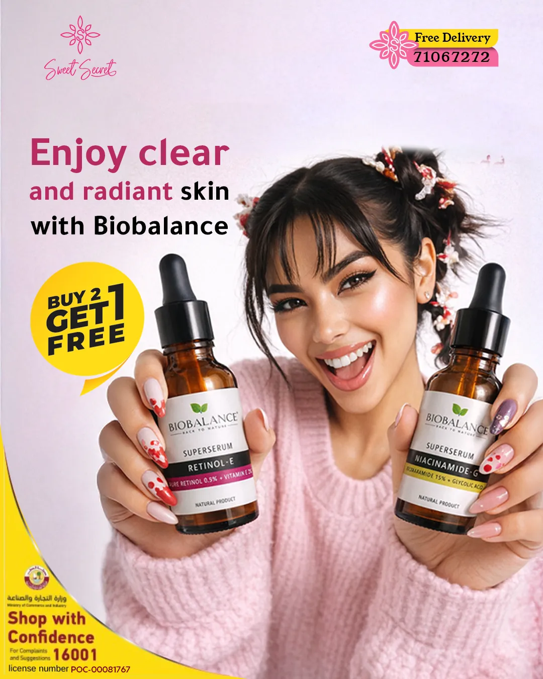 08
08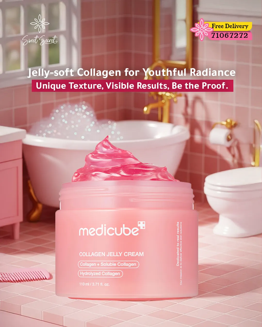 09
09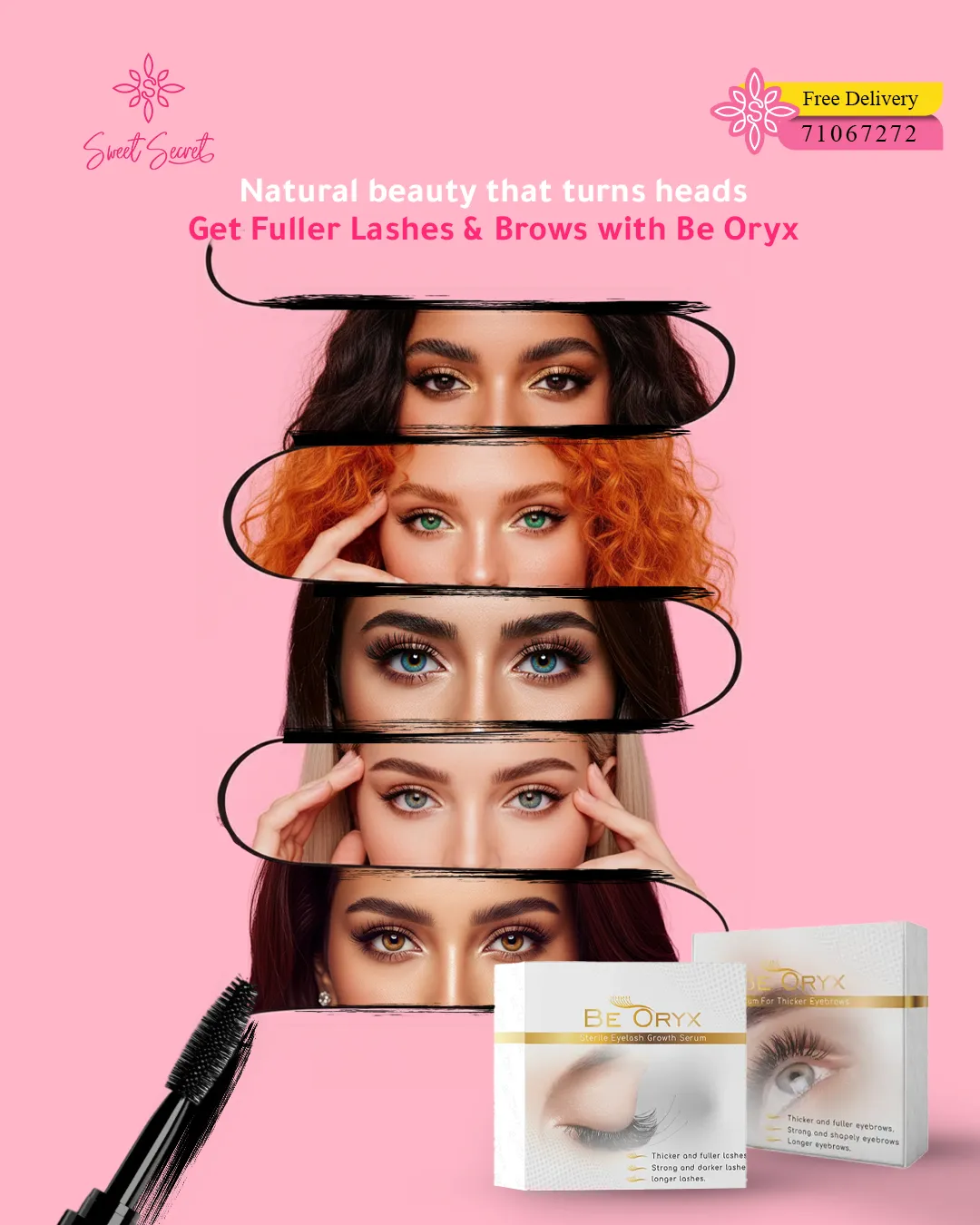
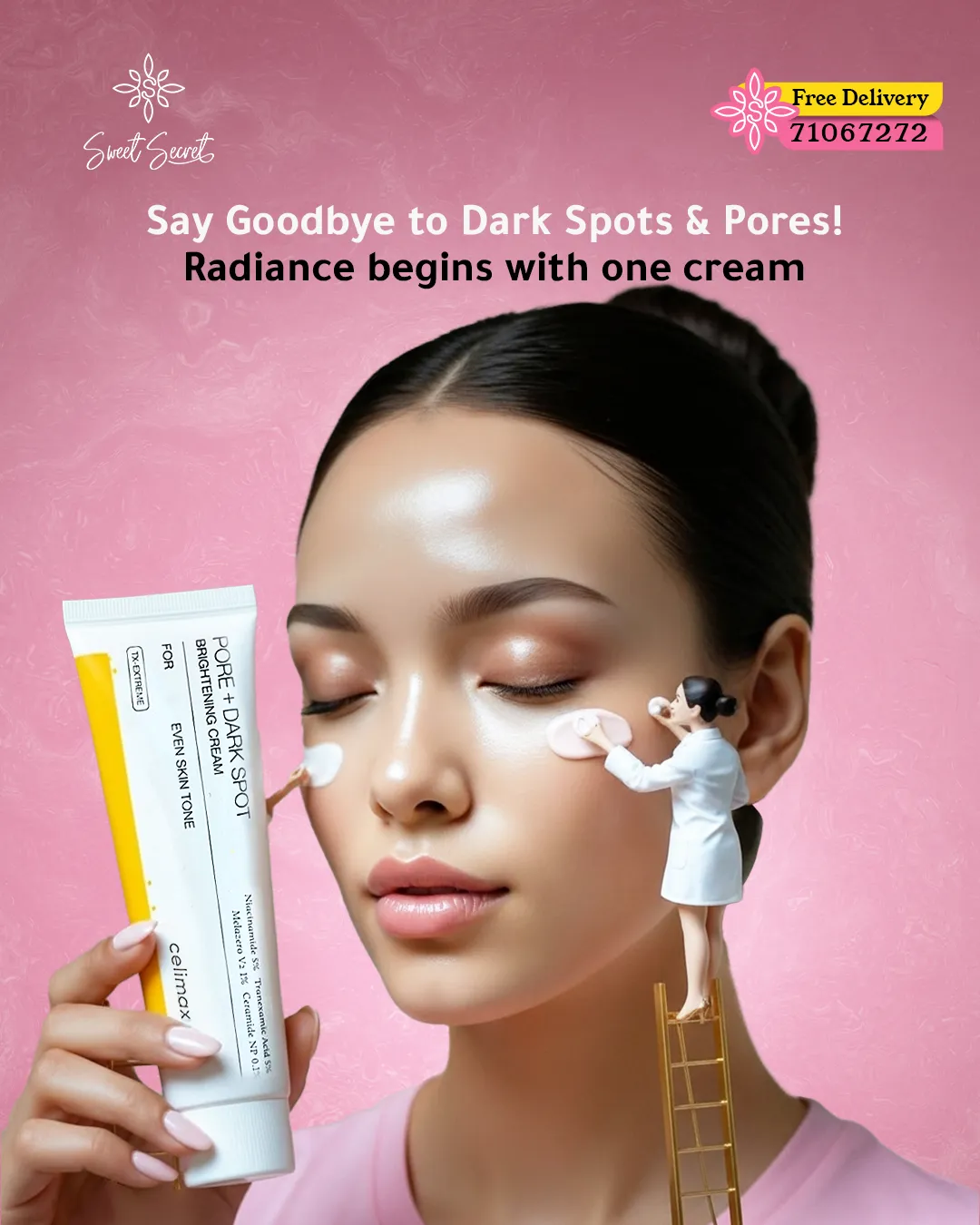
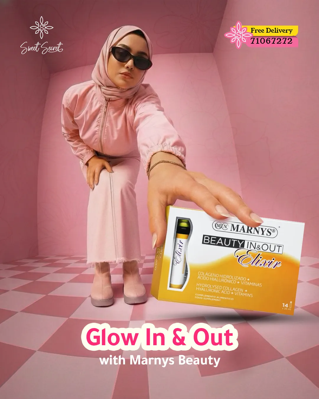
A locked grid, type scale and a single disciplined pink turned a crowded partner-brand feed into a recognisable Sweet Secret feed.
Clean pack-shots, gentle gradients and generous space made pharmacy-grade skincare feel like a boutique, not a promo flyer.
Modular templates let new arrivals, giveaways and seasonal moments ship weekly in both languages without redesigning from zero.