S
Sunlife Pharmacy logo
Retail Pharmacy & Healthcare · Qatar · 2024 — 2026

Sunlife Pharmacy

Field & Services Pharmacy & Healthcare Retail Social MediaGraphic DesignVideo EditCampaign Art DirectionIn-Store POP
Scroll
SL

Qatar's largest pharmacy chain needed to feel as big as it already was.

The Brand

Sunlife Pharmacy is one of the largest pharmacy networks in Qatar — a nationwide chain of stores serving families with medicine, skincare, supplements, mother & baby care and everyday wellness.

Trusted on the shelf, but online the brand was speaking in dozens of voices: every offer, every brand partner and every branch looked like a different company.

The Challenge

Hundreds of SKUs, weekly promotions, seasonal health moments and international partner brands — all fighting for the same feed, in two languages, with no shared visual grammar.

We had to make a pharmacy look premium without making it look clinical, and make a discount look designed instead of shouted.

Our Role

Headworks became the studio behind the brand's day-to-day output: one art direction system, a rebuilt offer template family, campaign key visuals, in-store POP and a full library of vertical product films.

Social, print and screen — designed together, released as one calendar.
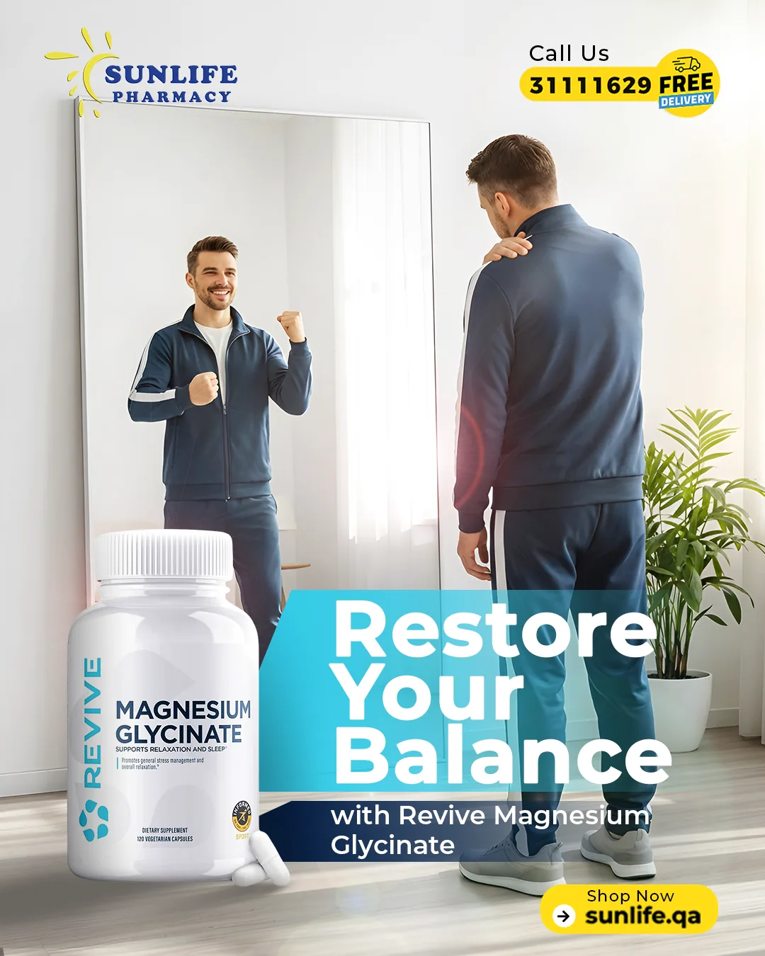
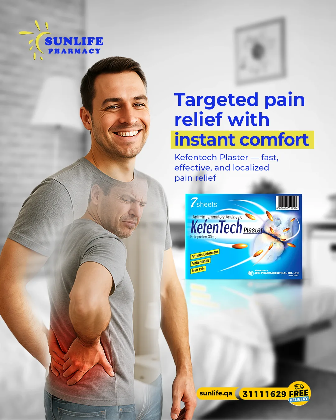
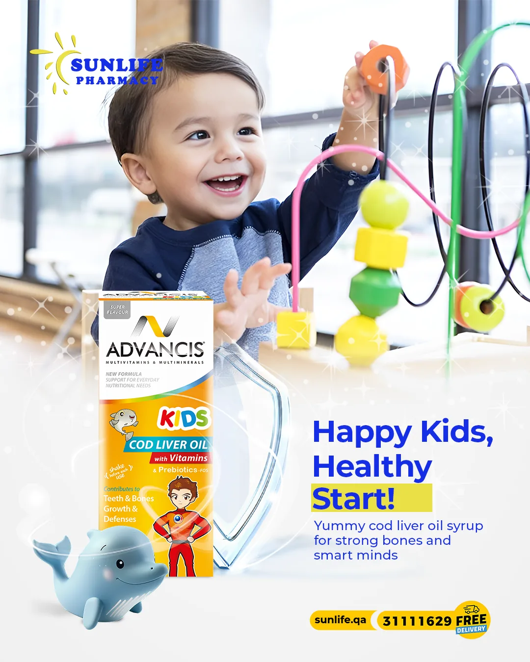
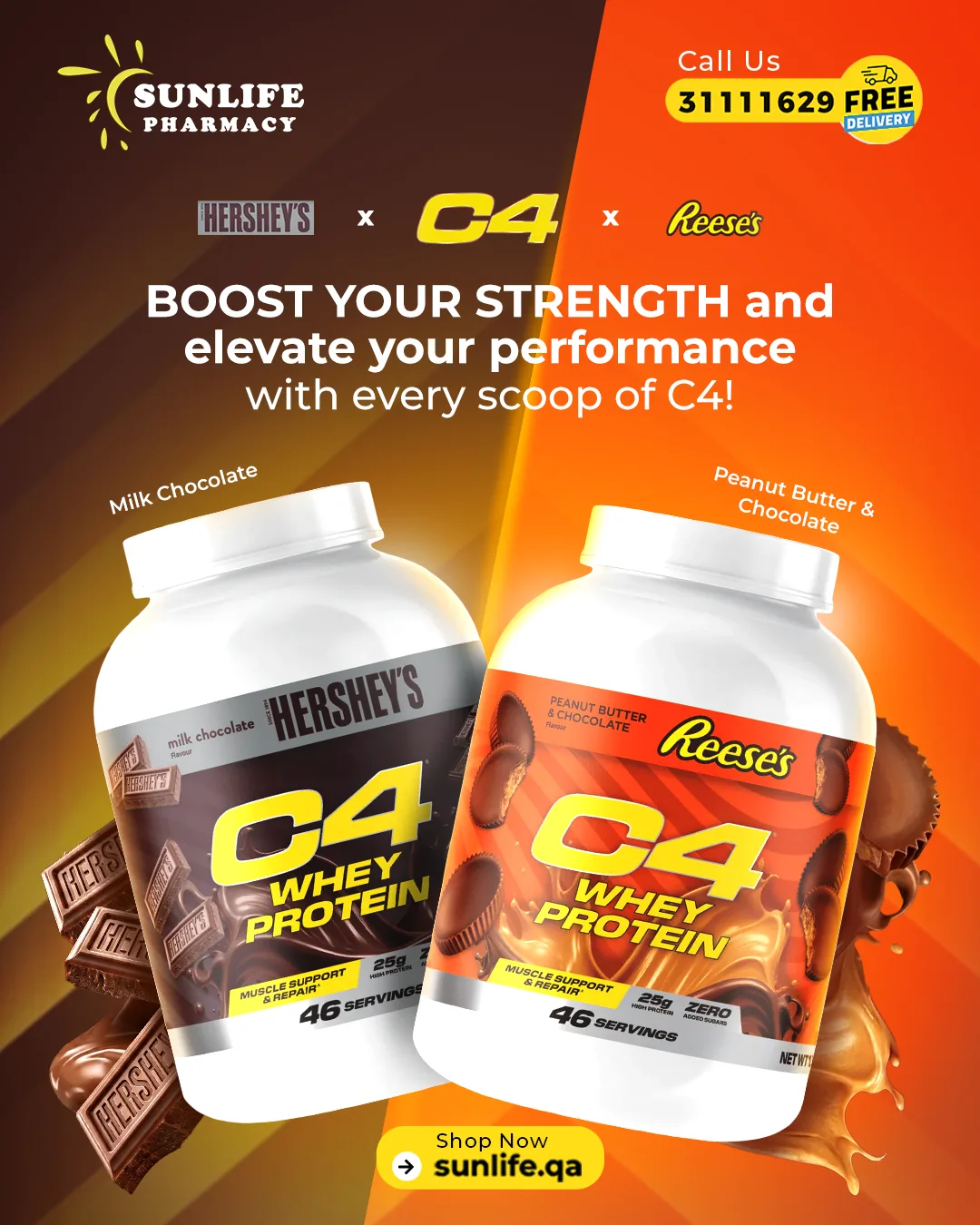
01 — Campaign Art Direction
Sunlife Pharmacy campaign cover01
Sunlife Pharmacy campaign slide02
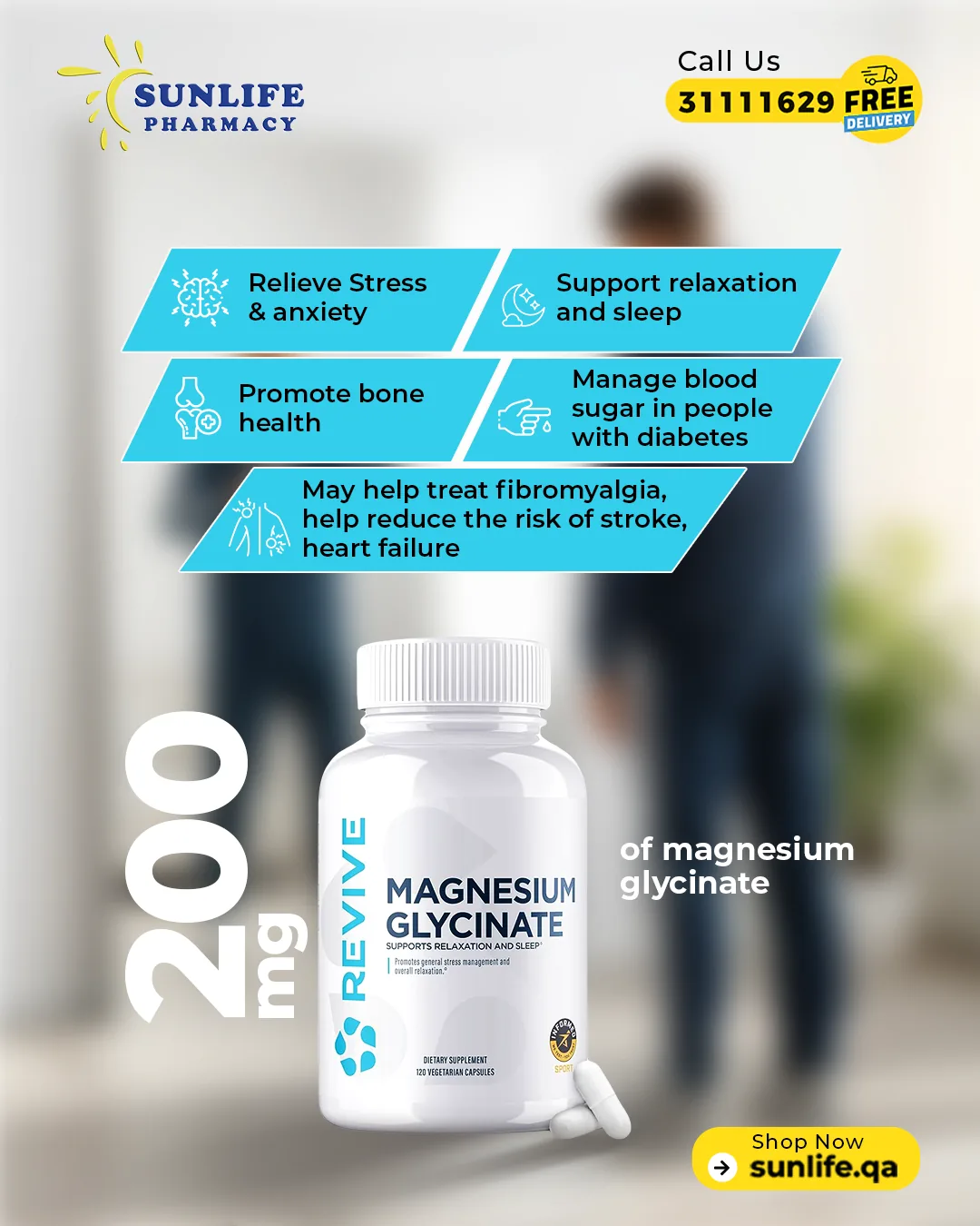
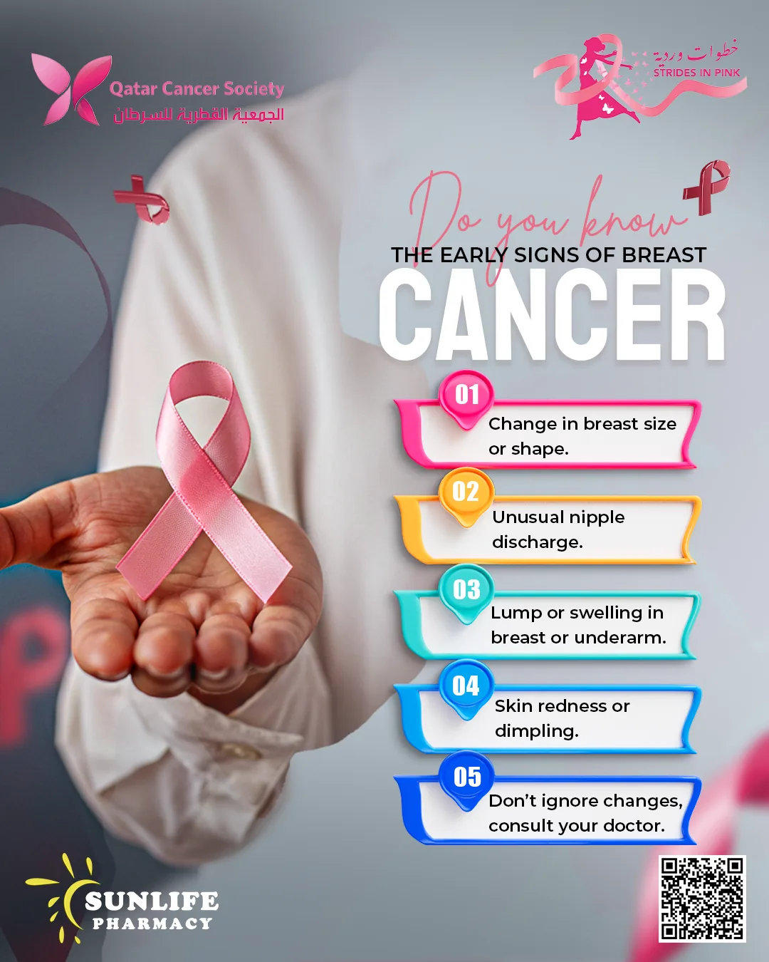
Sunlife Pharmacy health awareness key visual03
Sunlife Pharmacy awareness campaign layout04
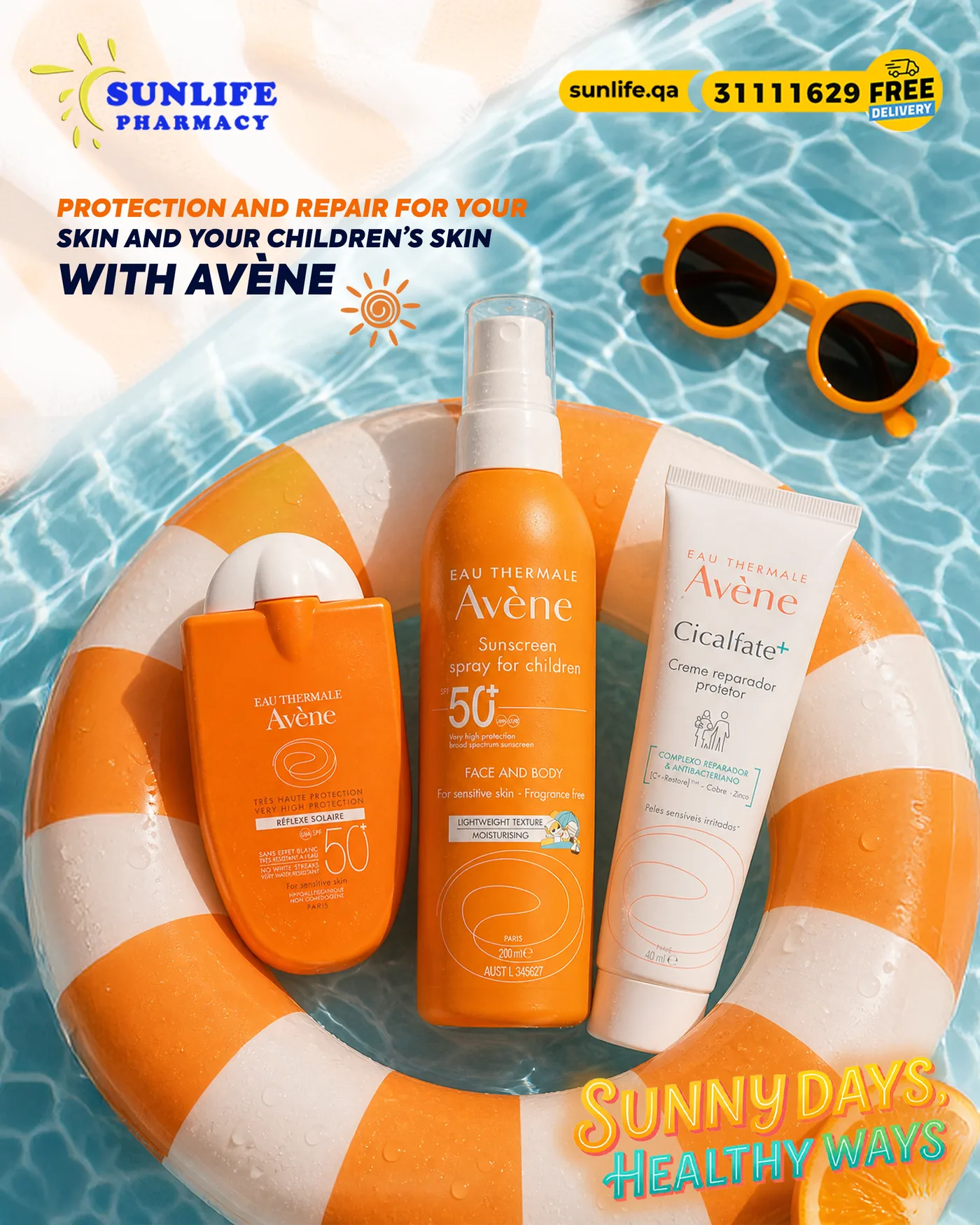
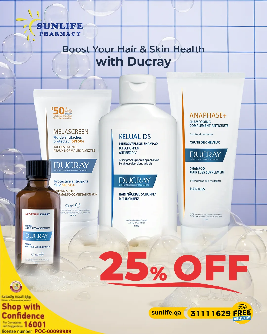
Sunlife Pharmacy skincare key visual
Care, styled.
Offer
system
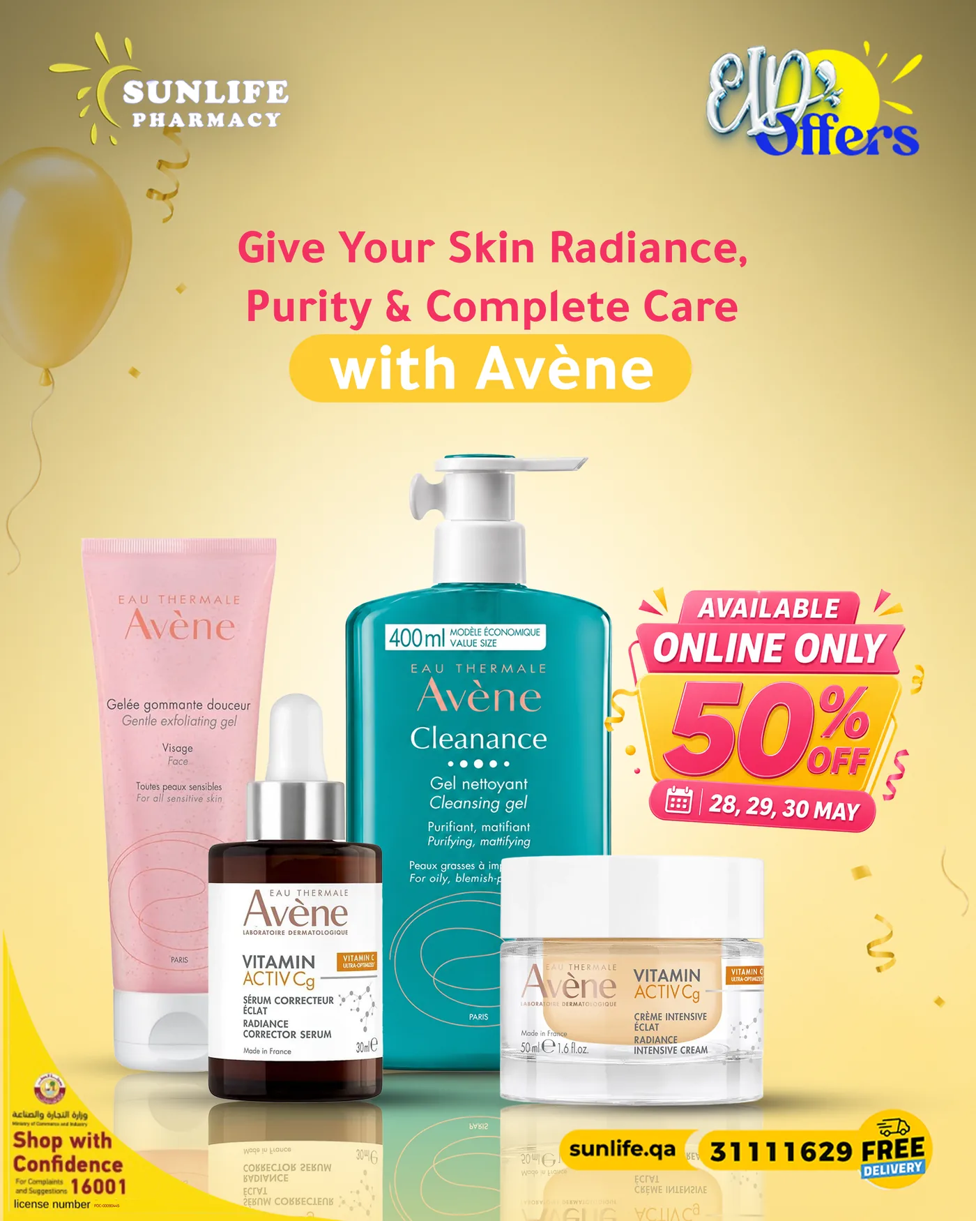
Sunlife Pharmacy Avene offer design
Partner Offer — 01
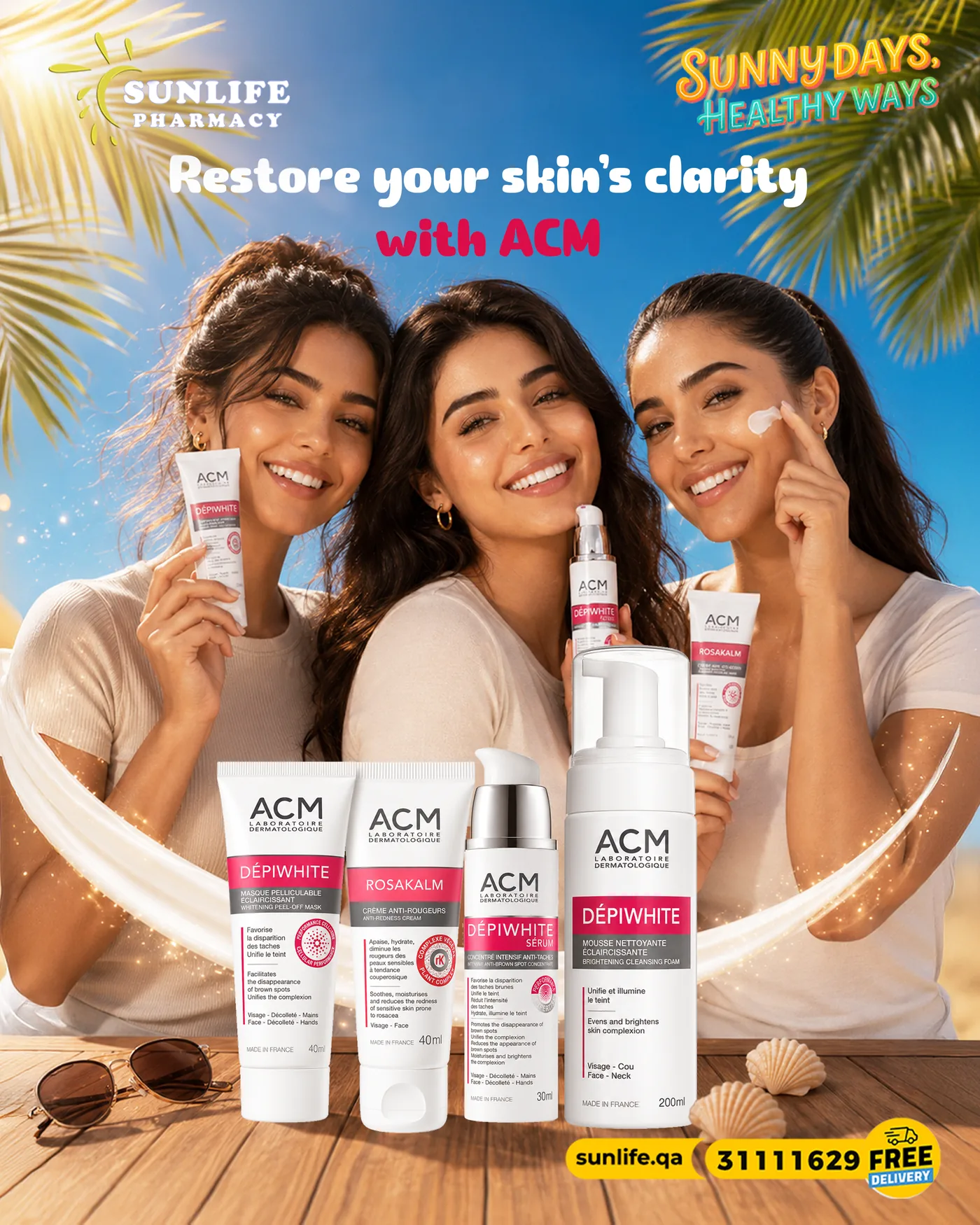
Sunlife Pharmacy ACM offer design
Partner Offer — 02
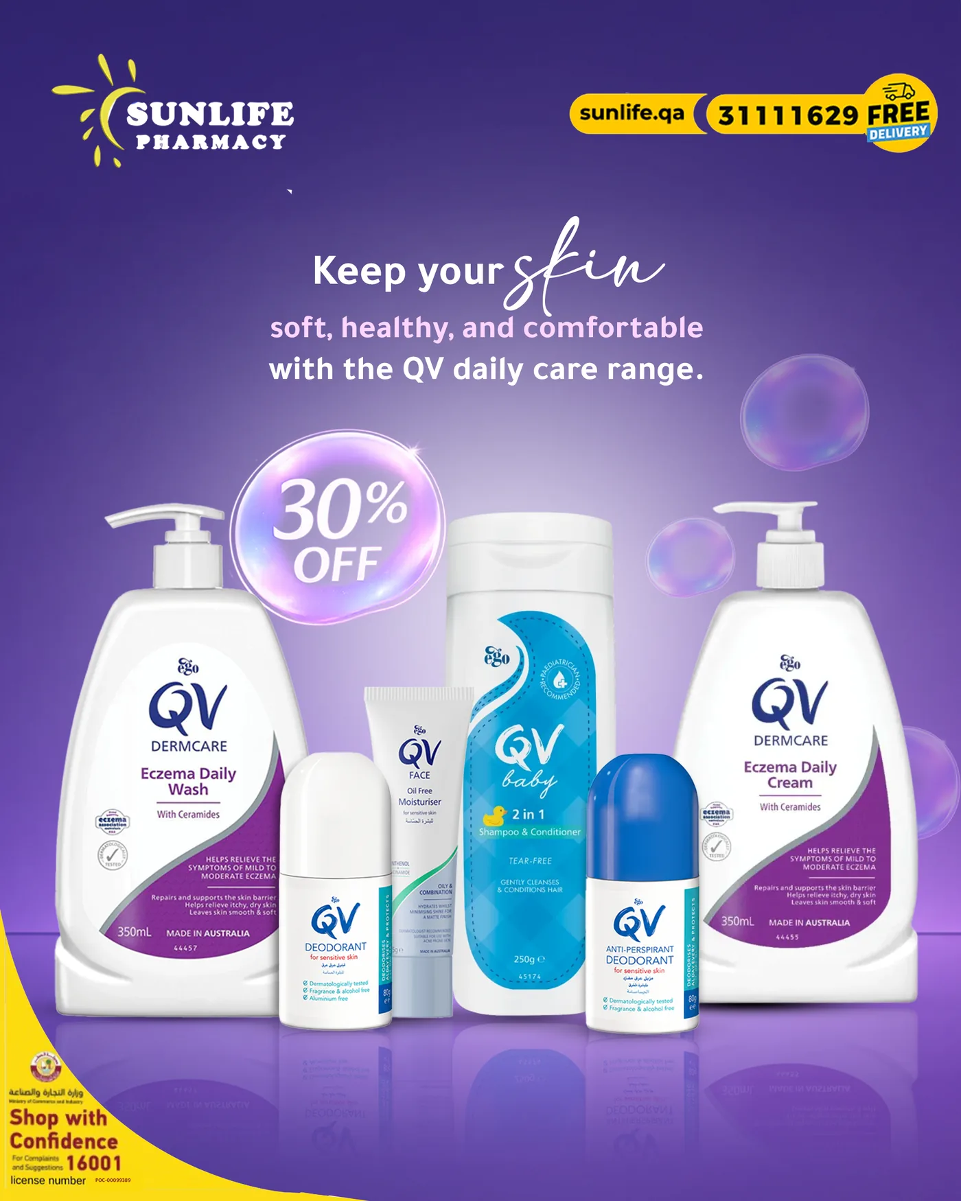
Sunlife Pharmacy QV 30% off design
Seasonal Offer — 03
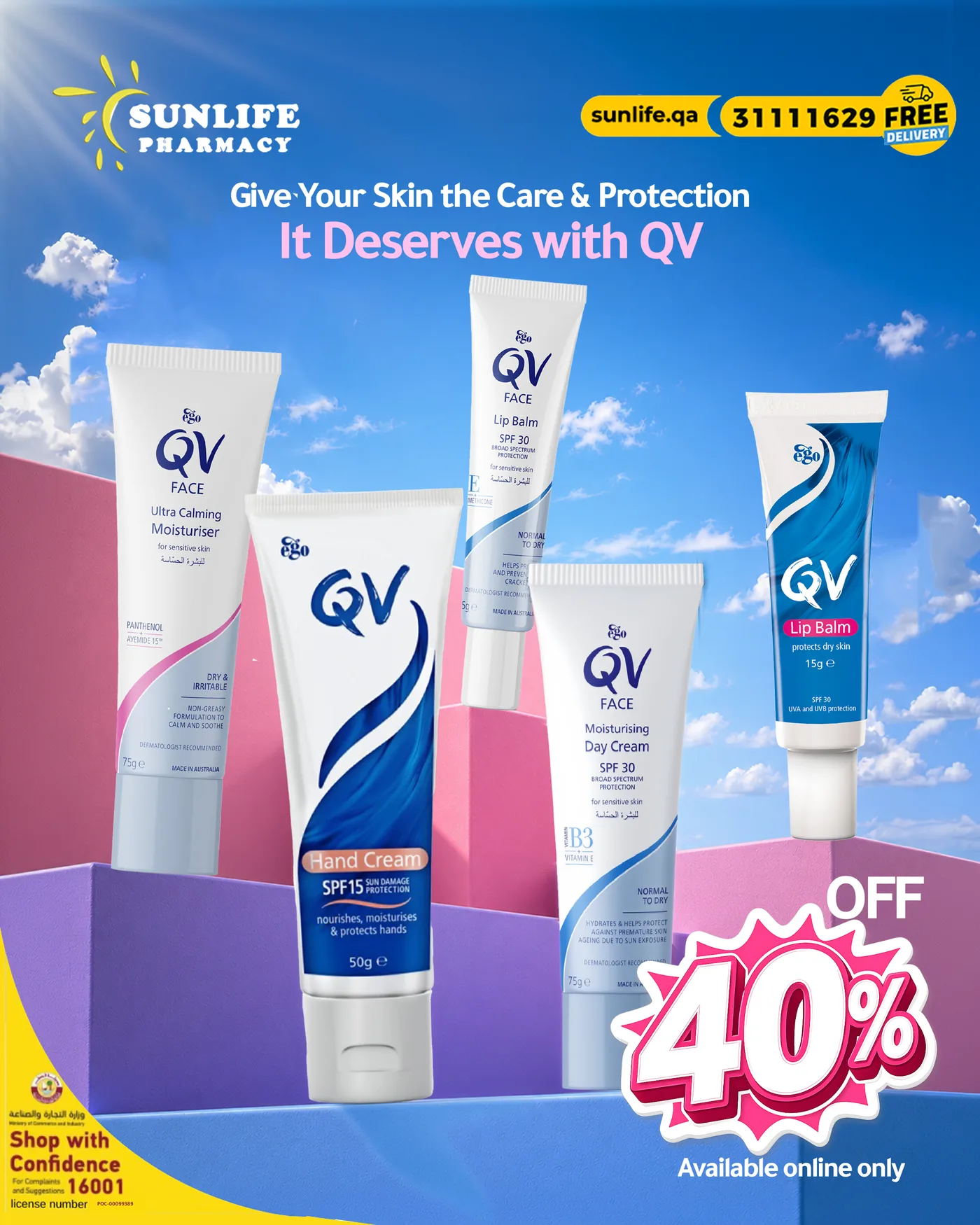
Sunlife Pharmacy QV key visual
Key Visual — 04
Sunlife Pharmacy Korean beauty offer design
Category Push — 05
Sunlife Pharmacy seasonal key visual
Seasonal — 06

Product
reels

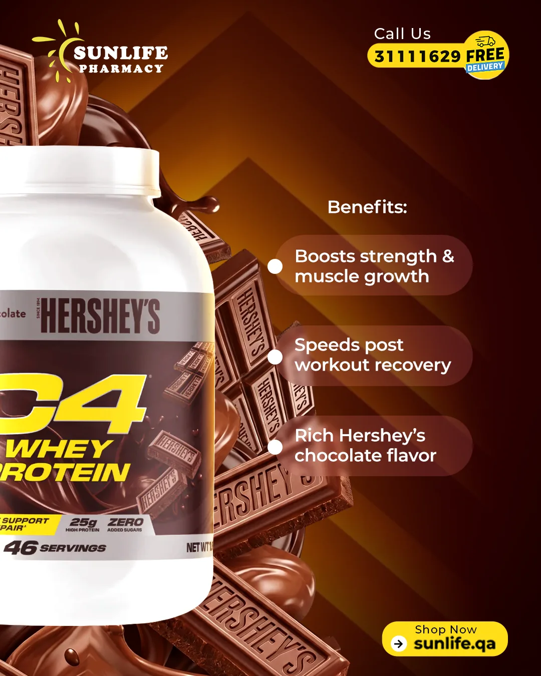
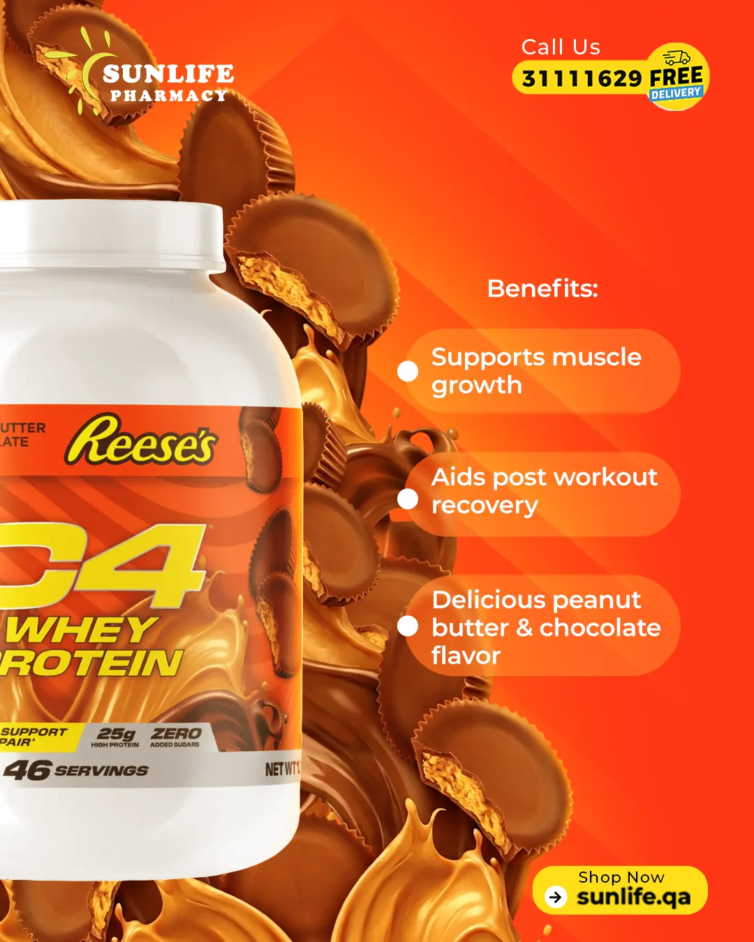
Vertical films built for the scroll: three seconds to explain a product, one second to make it desirable. Shot lists, motion, typography and pacing designed as one template family so the whole catalogue stays on brand.
REEL 01
Nature's Truth — Supplements
REEL 02
Precision Fuel — Sports Nutrition
REEL 03
Coxir — K-Beauty
REEL 04
Bio Oil — Skincare (AR)
REEL 05
Carrot Serum — Skincare
REEL 06
Vitamin D3 — Wellness
02 — In-Store & POP
Sunlife Pharmacy POP cover design05
Sunlife Pharmacy POP layout06
Sunlife Pharmacy POP detail07
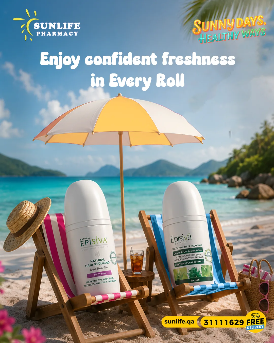
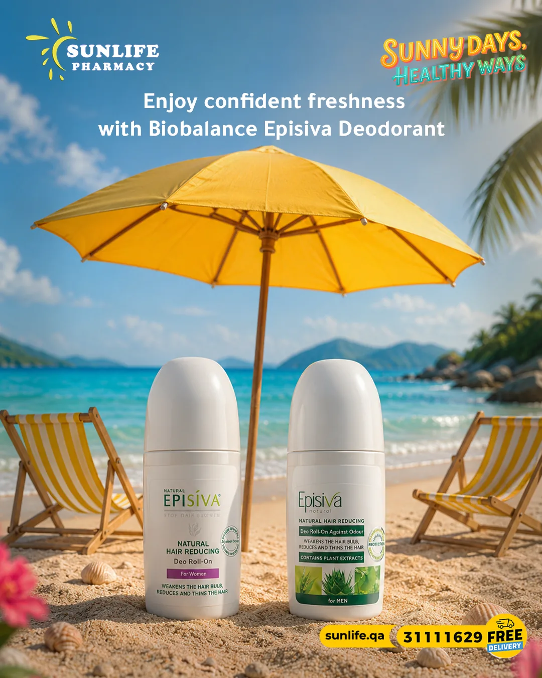
Sunlife Pharmacy roll-on product design08
Sunlife Pharmacy roll-on alternate design09
01
Sunlife Pharmacy social post
02
Sunlife Pharmacy social post alternate
03
Sunlife Pharmacy campaign key visual
The Impact

What changed
for the brand.

0
Average engagement per post versus the previous year's template-free output.
0
Designs, offers and POP pieces produced inside one consistent art-direction system.
0
Faster turnaround on weekly promos once the offer template family went live.
0
Arabic and English built as equals — same grid, same hierarchy, same confidence.
W

One retail chain, one voice — from the shelf edge to the scroll.

Consistency

A locked grid, type scale and colour discipline turned scattered promos into a recognisable brand feed. Followers now identify a Sunlife post before reading the logo.

Premium Perception

Skincare and beauty categories were art-directed like beauty brands, not like discount flyers — lifting how partners and shoppers read the chain.

Speed at Scale

Modular templates let a nationwide chain publish weekly offers across branches and languages without redesigning from zero every time.

Next Project

Popaya Nutrition

New Business

Got a brand
that deserves better?

Start a Project